
The vaccines are working
21 Mar 2021The high vaccination rate of those over 65 is now causing cases to decline faster in that age group. The vaccines are working.
This takes a little analysis to show, however. Wisconsin’s Covid cases peaked way back in November, due to (I believe) a combination of natural immunity and preventive behavior. Whatever the cause, it was far too early to be due to the Covid vaccines, which only began to be administered in December. So how can we see the effect of the vaccines from the state’s data?
One way would be to compare two groups of people with different vaccination rates, and see if their case trajectories were significantly different. People over 65 provide a good test case, luckily for this blog (and for the people over 65).
In Wisconsin, vaccine eligibility was opened to anyone over 65 starting on January 25. Before that, eligibility was limited to healthcare workers and people in long-term care. (Although for Wisconsin, only nursing homes received the vaccine starting in late December, assisted living was delayed until January 25.) At the time of writing, over 70% of seniors have received at least one dose, compared with about 25% for all ages combined. Therefore, between January 25 and today, I would expect to see the Covid rates among seniors decrease faster than the rates among other age groups.
The best data to use for this is DHS’s plot of weekly cases, by age group, by date of symptom onset or test result. Here is the full plot copied from the DHS website:
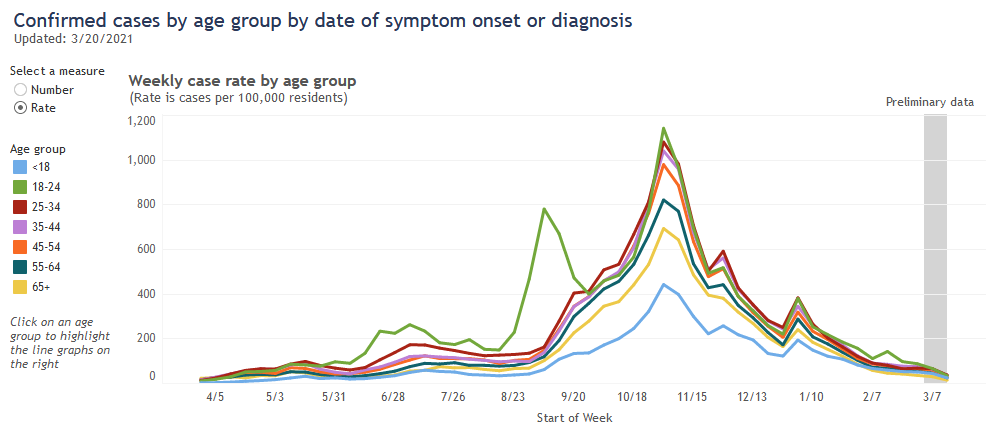
Recently, the over-65 age group (in yellow) has had the lowest case rate, a fact that the Milwaukee Journal Sentinel has linked to their high vaccination rate. I don’t think that fact alone shows much, however, because this age group already had the second-lowest rate throughout most of the pandemic. And because the case rates for all age groups have been going down since November, it’s difficult to pick out whether a particular age group has been going down faster than the others.
To be more sensitive to this kind of change, I used DHS’s data and tried to normalize out the overall peaks and valleys of the pandemic. The details require some explanation,1 but the results are in the plot below. It shows each age group’s per-population weekly case rate, divided by an “average” case rate for everyone ages 25-65. If an age group’s value is at 1, then its case rate is equal to the average; if it is above or below, then it is higher or lower than the average.
So this plot allows us to look at each age group’s case rate compared to everyone else’s, regardless of whether total cases are high or low, and pick out trends more accurately. What does it show?
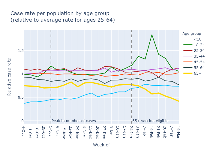
It shows that the vaccines work: the yellow line for cases in the over-65 group has decreased and diverged from other age groups. Moreover, this divergence starts in the week of February 7, two weeks after eligibility - which is telling, because the vaccine clinical trials indicated that high effectiveness begins two weeks after the first dose.
The plot also illuminates a few other points:
- Older age groups have generally had lower case rates; 65+ has a lower rate (its line is lower on the plot) than 55-64, which is lower than 45-54, etc.
- The 18-24 group had a mini-surge in mid-February, which I would link to college campuses.
- The under-18 case rate, while low, has gradually increased relative to the other age groups since the fall. I could guess at several possible reasons for this, including school openings; higher availability of tests making it more common to test mild-symptom cases in kids; or buildup of natural immunity in the other age groups leading to a higher share of cases in this younger group.
But the headline is that people over 65 are increasingly protected, and that is very good news.
-
First I took each age group’s weekly rate of cases per 100,000 population, downloaded from the DHS plot. Then I divided those rates by the average case rate for the ages 25-64. I think these middle age groups provide a good baseline for the course of the pandemic. Their case rates tend to move up and down together. In contrast, the 18-24 group has a very different pattern due to college outbreaks, and the over-65 group is the one I want to study. The under-18 group is also interesting on its own, so I exclude it from the average as well. An easier alternative would have been to divide by the average of everyone - but that has the disadvantage that large spikes in one age group, such as 18-24, then create an artifact in the relative rates for all the other age groups. Using the least-interesting 25-64 group as a baseline avoids this effect. ↩