03 Feb 2022
Wisconsin is now a couple weeks past the peak of the Omicron wave. Compared to last winter, the Omicron peak had about double the daily rate of cases; not quite the same rate of hospitalizations; but less than half the rate of deaths.
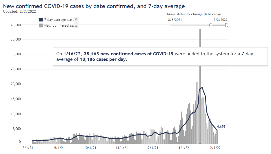
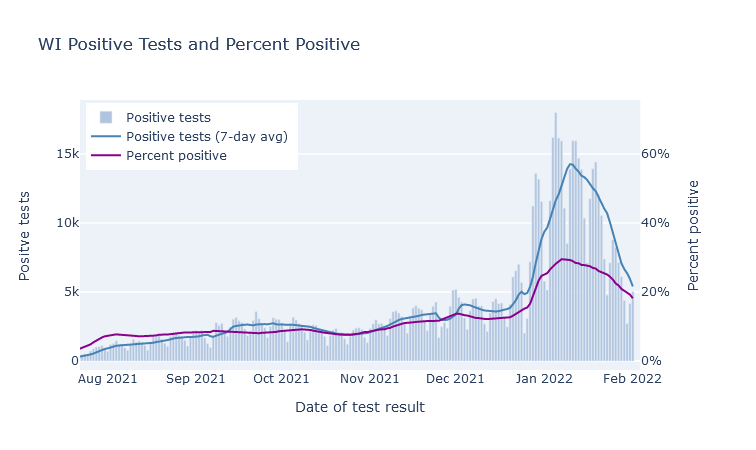
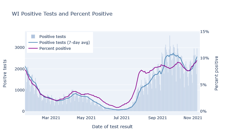
The peak rate of new infections happened about one week into January. This was not too clear at the time, because the unprecedented number of cases created a big backlog in state reporting. Then DHS flipped some switch on the 16th and cleared it (was that switch there the whole time?), flooding graphs everywhere with cases. Now that the dust has cleared, though, looking at cases by date of test return makes it clear the peak was at least a week earlier. Here are cases by day of report (including the big backlog dump), and positive tests by day of test result.
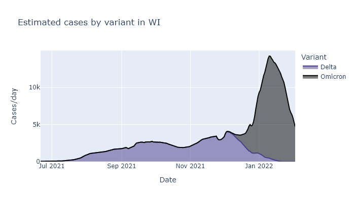
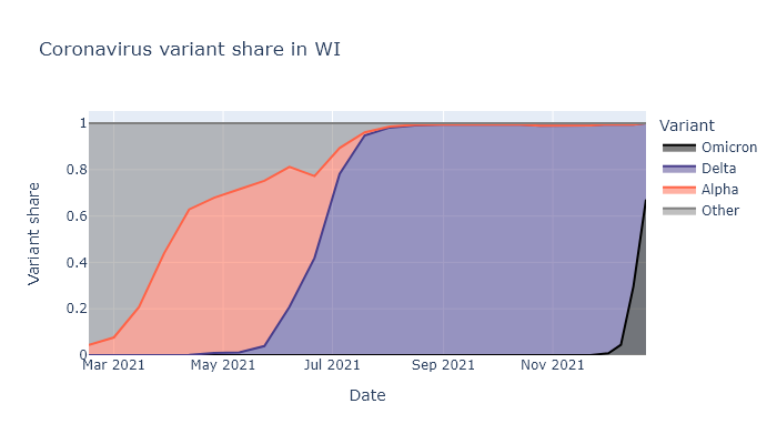
What proportion of these cases are Omicron, and what proportion are Delta? Delta started declining after Thanksgiving and Omicron has entirely taken over, incredibly rapidly. If Omicron hadn’t shown up, I think Delta would have still petered out on its own, but probably not as rapidly.
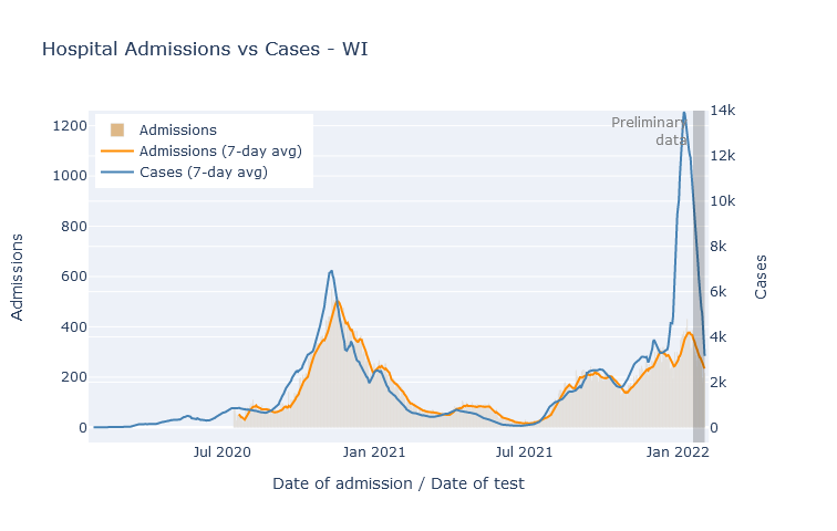
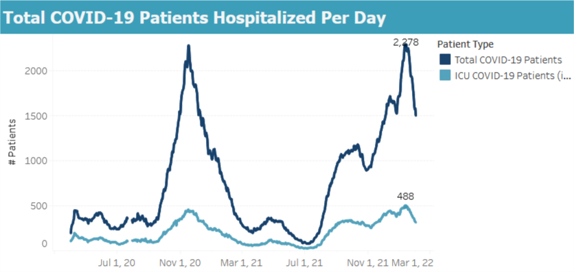
Despite the deluge of cases, the rate of new hospital admissions topped out at a bit below last winter’s peak, and is now declining as well. A different measure of hospitalization, the total number of people in the hospital at one time, reached just four patients higher than last winter’s peak and is also declining.
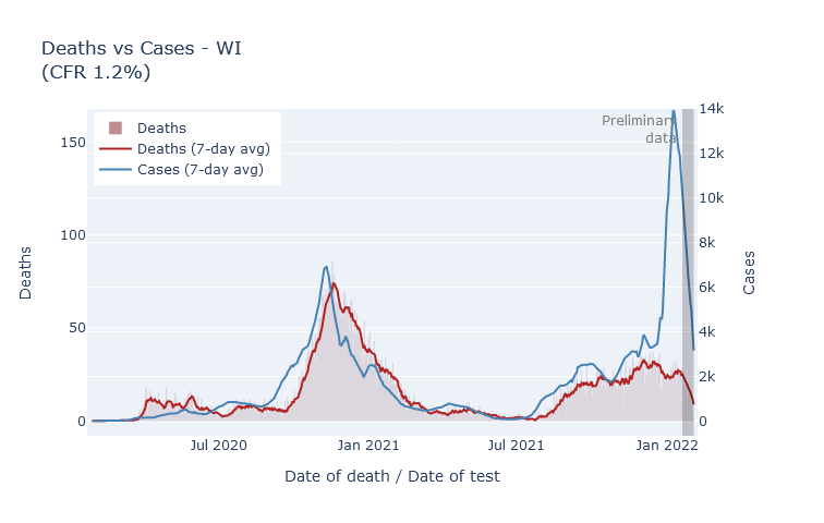
The outlook on deaths is also encouraging. Now, I don’t trust that the plot below is really complete yet, because more death reports will filter in over the coming weeks. But it has been a long enough time that I don’t think it will change drastically. So duly caveated, the peak rate of deaths from Omicron was not even half of the rate from last winter, and in fact may end up lower than the peak of Delta deaths from the previous month.
Overall, compared with last winter, Omicron brought us two times the peak of cases, a notch fewer hospitalizations, and less than half the deaths. Still a crappy Christmas present, but thankfully it did not turn out as badly as it might have.
30 Dec 2021
Omicron is here in Wisconsin. It will cause a large spike in cases; outcomes will be less severe than previous waves. I am not going to try to predict how large or how much less.
O, I am fortune’s fool
See, whenever I make a prediction, Covid seems to take that as an invitation to sweep the world with a new variant. Last June I predicted a quiet summer and smallish winter wave; by July Delta had taken over the state, sparked a late-summer wave that only got worse in winter. Then in early November I predicted that Wisconsin would see a sizable winter wave of Delta, but that this would be the last major Covid wave. Two weeks later Omicron was discovered.
We’re still having a winter wave, of course, but its complexion is going to be different.
Omicron in Wisconsin
As of this writing, it looks like Omicron already makes up about two-thirds of cases in Wisconsin, and will likely be more than 90% within another week or two. It was less than 5% at the beginning of December. The warnings about how fast it would take over and spread turned out to be true. The plot below shows what fraction of cases is attributable to each variant dating back to March. For a similar but updated dashboard, see the State Library of Hygiene website and click “Variant Report”.
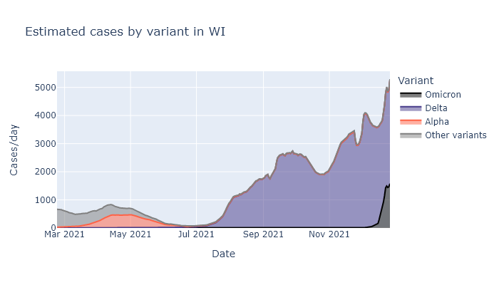
I think we are just starting to see this translate into a spike of new cases. Below is a plot of positive tests multiplied by the variant fractions above. The rise in the last week sure looks like the start of our Omicron spike. (The small dip in the last couple days is from lower numbers of tests over Christmas.)
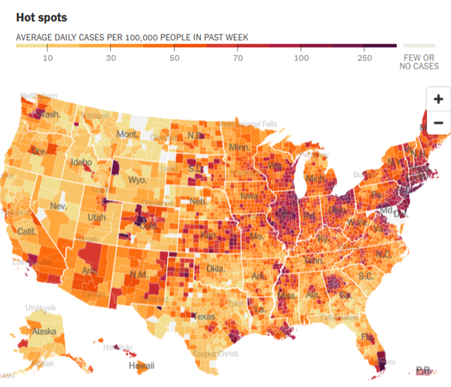
Based on how this is playing out in other states, I expect it to show up first in the cities, where it first gets seeded by travelers. This pattern is easiest to see in states where cases levels were previously pretty low. The map below is from the New York Times - see if you can find Miami, Atlanta, and Houston, not to mention New York City, Washington DC, and Seattle.
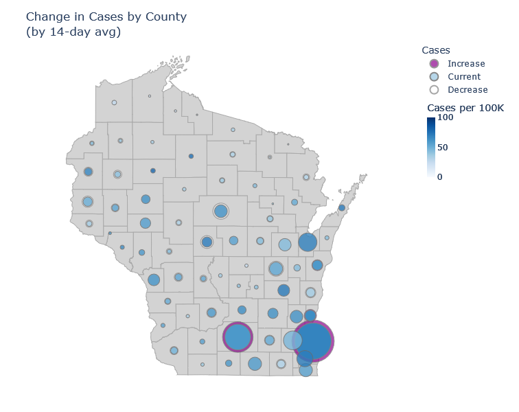
In Wisconsin I think we’re starting out similarly. Milwaukee and Madison are the only counties currently showing a significant increase in cases averaged over 14 days. I’m guessing that will ramp up and then spread to the rest of the state.
Onset and outcomes
So what now? Here’s what I think we know about Omicron. A good summing-up reference is the UK’s risk assessment.
Transmission. Omicron is clearly spreading quickly and overtaking Delta. This is because:
- Omicron reduces protection against new infection from existing immunity, making breakthrough and reinfection more likely.
- It probably has a shorter transmission interval (the time between infection and onward transmission), which means it both spreads and peaks faster.
- For those without immunity, it may have comparable transmissibility to Delta. This is less clear, because it is hard to disentangle intrinsic and immunity effects.
Severity. Outcomes will most likely be less severe than in previous waves.
- Existing immunity holds up against severe disease, better than against infection.
- Omicron looks to be moderately less severe than Delta, even apart from immunity. (Moderate meaning something like 50% lower risk of hospitalization, not like a common cold.)
So we will see a lot of infections, but each infection is less likely to be severe than in previous waves. I don’t think we know enough to predict precisely how that will multiply together. We’ll find out pretty quickly.
11 Nov 2021
Wisconsin has been on a Covid plateau for a while. Still, I have been waiting for signs of a true winter wave, and I think the data from the last week show that it is starting. If it is, I expect moderately fewer cases than last winter, far fewer deaths, and that this will finally be the last major wave.
Just when you thought it was safe to go back to choir practice
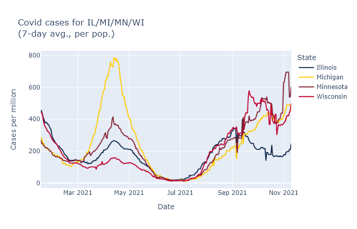
In the last two months Wisconsin has seen a consistent, moderate level of new cases. The Delta variant was responsible for the initial rise in late summer. While the Delta wave crested very high in the South, comparable or worse for them than last winter’s wave, here cases plateaued and have just been plugging along. The plot below shows the number of positive tests and the positive test rate (positives / total tests) for Wisconsin over the last several months.
There was a further boost in September that I think was primarily due to schools, in a combination of increased transmission and increased testing. You can see in the plot above that positive tests bump up in mid-September, but the postivity rate dips, which indicates that a portion of the cases were probably just from increased testing. (Perhaps from contact-tracing school cases?) The positivity rate then goes back up though, so there was increased transmission going on as well.
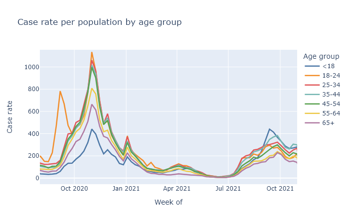
If you break out cases by age, we see that school-age kids and those 35-45 (their parents) have the highest case rates in this September bump. The other age groups do follow along, but their trajectory is a lot more gentle. This possibly school-driven bump lasted several weeks, and then began to subside. The plot below shows weekly case rates broken out by age, including data from last fall for comparison.
I wonder if this is a dynamic similar to last fall with college students, where the start of the school year resulted in a large spike of cases, which then settled down and basically followed the trajectory as everyone else. I might speculate that large changes in people’s contacts and socializing can result in case spikes, which then can subside after an adjustment period.
In any case, the fading of the September bump did not last long. This week I think we are finally seeing the beginning, not of the Jordan Love era, but of a true winter wave. The graph at the top already showed the rise in cases and positivity rate in Wisconsin over the last week. The same thing is happening in all our bordering states, which makes me more confident it’s a seasonal effect instead of something more idiosyncratic. Here are reported cases for us and our three nearest neighbors, using data from the New York Times.
Better than the original
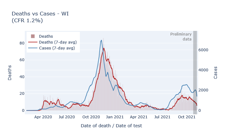
Fortunately, the fatality rate has been lower for the fall wave so far, which I think is directly due to the vaccine. The most vulnerable ages have high vaccination rates, which means the pool of unprotected people is less at risk of death. The plot below shows deaths by death date and cases by diagnosis date from the beginning of the pandemic. The scale is set so that the lines overlap when the ratio of deaths to cases (the case fatality rate, CFR) is 1.2%. During last winter’s peak the CFR was about 1.2%; so far this fall it’s more like 0.7%.
But why are deaths even this high? If the vaccine is supposed to be 90% or more effective at preventing death, why is the death rate only 40% lower than last winter? Well, the majority of people getting sick are not vaccinated. So the reduction of the death rate is mostly not because the vaccinated people getting sick are not dying, but instead because the unvaccinated people getting sick are less old on average than they were last winter.
The final chapter
The other bit of good news is that I think this wave will be limited, because we are running out of people without some immunity. A few posts ago I tried to estimate how many Wisconsinites had some kind of immunity, whether acquired by vaccination or by infection. Since then, of course, more people have gotten both types, I made an updated estimate. The green bar represents the percentage of people who have been vaccinated, the blue bar an estimate of the people who have been infected, with infections estimated at three times the official number of cases.
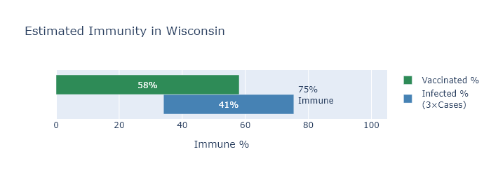
By this estimate, only about 25% of Wisconsinites still have no immunity to the virus. This sets some boundaries on how big this new winter wave can be. Our first winter wave infected about 30% of the state; even if this winter wave catches everyone left, it would still be smaller.
Now I think this immunity estimate may be a bit low, for reasons I listed in the previous post, and I also don’t think literally everyone will end up infected. We’ll also pick up some more vaccinations before the wave is over. On the other hand, there will be some reinfections or breakthroughs adding to the total.
Overall, my wild guess is to expect somewhat less than the 25% to get infected in this wave, maybe only 10-15%, for 600-900 thousand infections. Divide by 3 for an estimate of another 200-300 thousand official cases; multiply that by the current case fatality rate of 0.7% for 1400-2100 more deaths.
And then I think we really will be done with large waves. Smaller spurts or moderate seasonal waves may still happen, but even if another variant comes along there will be too much built-up immunity for another big one.
Or that’s my best guess. Who the hell knows, of course - they do seem to keep coming out with sequels.
15 Oct 2021
DHS has released their latest update on breakthrough cases with data for the month of September. The risk reduction from the vaccines appears to be pretty much the same as last month.
September data by age group
Last month I wrote in detail on how to interpret these data, so for more background and August’s numbers please see that post. Here I want to share plots of this month’s data, and show how the age-adjusted risks are changing with time.
The bar plots below are a little complex, but I think helpful. Each compares vaccinated and unvaccinated groups for a different outcome: deaths, hospitalizations, and cases. The height of the bar indicates the rate of that outcome per 100,000 people. The width of each bar is proportional to the population of the group.
Finally, the plots are divided up by age group, because the risk of death and hospitalization is so dependent on age.
In general, the patterns here are very similar to last month. Some differences are that numbers overall are higher, and that teens make up a larger share of cases. But the vaccines continue to provide very strong risk reduction against death and hospitalization, and pretty strong reduction against getting a case.
Estimated age-adjusted vaccine efficacy by month
Boiling this down to a single number, the table below shows estimates of vaccine efficacy based on this data for this month and last month. These numbers are age-adjusted, a process I also tried to explain in last month’s post.
| Outcome |
August |
September |
| Cases |
73% |
78% |
| Hospitalizations |
88% |
89% |
| Deaths |
89% |
95% |
Efficacy appears to have even improved a bit this month, but I would guess that is just some randomness in the data. But it is good news that while efficacy seems to have declined compared to the spring, it looks to be pretty stable right now.
23 Sep 2021
The Wisconsin DHS has begun releasing data on the rates of deaths, hospitalizations, and cases by vaccine status. This gives us the most direct look yet at how the vaccines are working in the real world, and against Delta. They say that in August, an unvaccinated person has been 11 times as likely to die, 9 times as likely to be hospitalized, and 4 times as likely to get a case as a vaccinated person. But where do these numbers come from?
Some adjustments required
To be clear, they are not just comparing the numbers of X deaths among the unvaccinated to Y among the vaccinated. There are a couple reasons why that would actually be a bad idea for judging the effectiveness of the vaccine. For starters, the size of the vaccinated and unvaccinated groups can be very different.
Let’s take the example of deaths among those over 65. Here is a bar graph of the raw numbers of deaths, in August, in the vaccinated and not-fully-vaccinated groups. (The not-fully-vaccinated group includes people who have only received one dose, and people who have already had Covid. For brevity I am going to label them “Unvax” in these plots, but it is more complicated than that.)
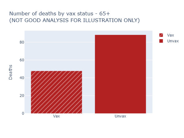
This looks like the vaccine only reduces the risk of death by half, much worse than we’ve been promised. Luckily, this is not the right way to think about it at all (and for that reason DHS doesn’t even display these numbers explicitly). It overlooks that nearly 90% of those over 65 are vaccinated, so these 48 vaccinated deaths are coming from a much larger group than the 88 not-fully-vaccinated deaths.
So here’s another plot that visualizes the data better. The height of the bar now indicates the rate of deaths per 100,000 people in each of the vaccinated or not-fully-vaccinated groups. The width of the bar indicates the population of the group. That means the total area of each bar is proportional to the raw number of deaths, but the height more accurately shows the risk reduction from vaccination. For this age group, this per-capita rate of deaths among the unvaccinated was 9 times higher than in the vaccinated.
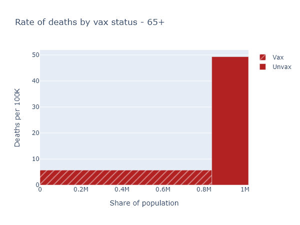
That big empty space above the vaccinated bar and left of the unvaccinated bar represents, plausibly, the number of deaths prevented by the vaccine in this age group.
Accounting for age
So now we know to always use per-capita numbers. Let’s look at deaths again (per-capita, of course) for the whole population.
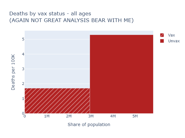
This is confusing again - the risk reduction here only appears to be a factor of 3. But that’s much lower than we just saw for the over-65, which we know is the group most at risk of death. How does that make sense?
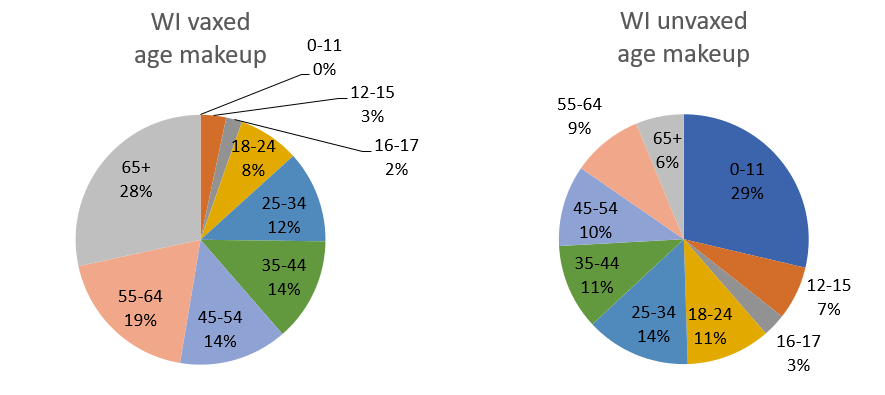
We have to realize that if we compare the vaccinated and unvaccinated for the whole population, these two groups differ in two ways that we know strongly affect the death rate: vaccination status, obviously, but also age. In Wisconsin over 80% of people over 65 are fully vaccinated, while zero people under 12 are. The age makeup of each group is very different:
This means you can’t make a good comparison across vaccination status without accounting for age.
To get some intuition for this, let’s imagine a simpler, more extreme situation. Imagine that our entire population was half kids under 12, who are all unvaccinated but still vanishingly unlikely to die; and half retirees over 65, who are 100% vaccinated but still have some likelihood of dying (albeit much reduced, say by 90%). In this population 100% of Covid deaths would still occur among the vaccinated, and 0% among the unvaccinated. But that would not be because the vaccines were ineffective. It would be because the elderly were both more likely to be vaccinated, and still more likely to die of Covid than the younger, unvaccinated group.
The real situation in our state and the country is not so extreme, but it has the same kind of pattern. To get an accurate picture of vaccine effectiveness, we have to separate out data by age group, or adjust for age in some way.
The data itself
Separating and adjusting for age is just what DHS has done in the latest data release, although I think there is some room for better visualization and explanation.
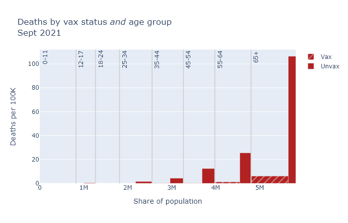
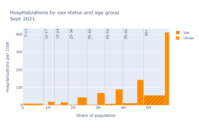
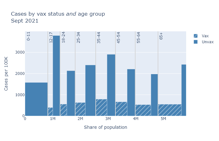
Below are three plots that show DHS’s August data for deaths, hospitalizations, and cases, separated out by age group. Again the height of each bar shows the rate of the outcome per 100k people, showing the risk for that vax and age group, and the width indicates the population of that group. The tall narrow bar for unvaxed deaths over 65 means the group is small and the risk is high; the wide short bar for unvaxed hospitalizations under 12 means the group is large but the risk is small.
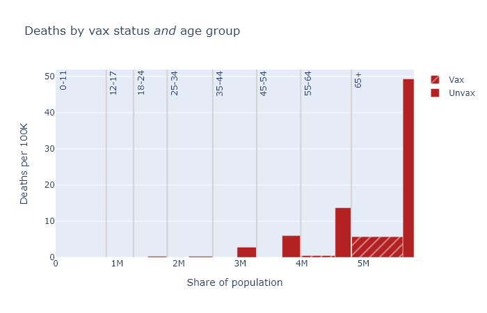
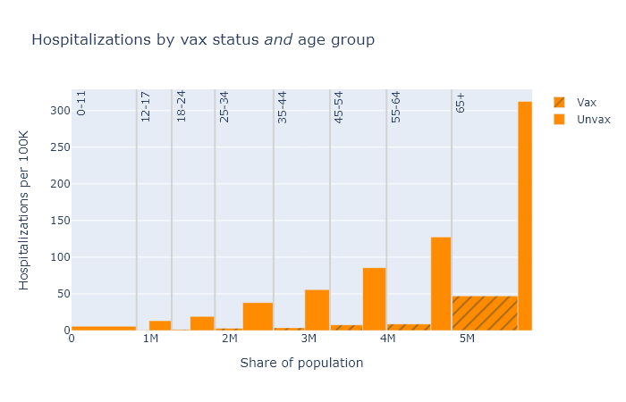
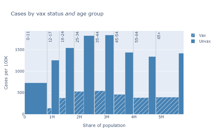
A few points become apparent in these plots.
- Absolute risk (the height of the bars) for deaths and hospitalizations are clearly much higher for older people. Risk of getting a case is more roughly equal.
- The relative risk reduction (the ratio of the height of the unvax bar to the height of the vax bar) is pretty consistent across age. If you’re in your 30s or 40s, the absolute risk of death from Covid is not that high, but the vaccine makes you basically invincible.
- The protection against getting a case is clearly not as good as it is against death and hospitalization. But the vaccine still reduces your chances of getting a case by about three-quarters.
In this post I’ve been belaboring group size and age, but of course there are other possible factors to consider. The not-fully-vaccinated group includes people with only a single dose; people who have had Covid already clearly also have some immunity; maybe vaccinated people are still being more cautious on average; maybe vaccinated people are more (or less) likely to get tested and find a case. This profusion of confounders is the big limitation of observational data like this. Nevertheless, I think group size and age are big and basic, and as long as we take these into account we’re getting a pretty good idea of vaccine effectiveness.
Age-adjusted numbers
Finally, with this background I can explain DHS’s headline numbers from the first paragraph, which are “age-adjusted” estimates. As we have seen, the vaccinated and unvaccinated groups have different age distributions. Age adjustment uses the data we have to estimate what the total per-capita deaths would be if both groups had exactly the same age distribution as the population as a whole.
In math, for each age band, (adjusted vaxed deaths) = (observed vaxed deaths) × (fraction of total population) / (fraction of vaxed population). Then add them up and divide by the total population to get the adjusted deaths/100k. Then do the same for the unvaxed group data. This is not dark statistical magic. I reproduced the DHS’s numbers in Excel in about a half hour - an Excel sheet I’ll share with those hypothetical readers who would like to replicate it themselves.
For an individual, it’s more accurate to look at the age-specific numbers. But this age-adjustment procedure gives us the best single number for the risk reduction from vaccination, taking the population as a whole. It is also, I think, something we can fairly compare with the vaccine efficacy as reported in the original clinical studies, though it’s definitely not perfect.
Here is a table of these age-adjusted risk factors and vaccine efficacy values for each outcome, again based on this August data. The risk reduction is calculated as the age-adjusted, per-capita rate for the unvaccinated group divided by the rate for the vaccinated group. The vaccine efficacy is simply 1 - 1 / (risk reduction).
| Outcome |
Risk reduction
(age-adjusted) |
Vaccine efficacy
(observed) |
| Cases |
4× |
75% |
| Hospitalizations |
9× |
89% |
| Deaths |
11× |
91% |
These efficacies are lower than what was originally reported in the clinical trials, which found about 95% efficacy for symptomatic disease (kind of the same as cases, but not exactly), and even higher numbers for severe disease and death. This data would seem to support the idea that some combination of the Delta variant and waning immunity has reduced the effectiveness of the vaccines.
But look, the effectiveness is still really good! The vaccines still work.
Acknowledgments
I’m indebted to the blog Covid Data Science for discussion of these issues and demonstrating how to do this analysis. Here are two relevant posts.