
Vaccines (yes, still) work
23 Sep 2021The Wisconsin DHS has begun releasing data on the rates of deaths, hospitalizations, and cases by vaccine status. This gives us the most direct look yet at how the vaccines are working in the real world, and against Delta. They say that in August, an unvaccinated person has been 11 times as likely to die, 9 times as likely to be hospitalized, and 4 times as likely to get a case as a vaccinated person. But where do these numbers come from?
Some adjustments required
To be clear, they are not just comparing the numbers of X deaths among the unvaccinated to Y among the vaccinated. There are a couple reasons why that would actually be a bad idea for judging the effectiveness of the vaccine. For starters, the size of the vaccinated and unvaccinated groups can be very different.
Let’s take the example of deaths among those over 65. Here is a bar graph of the raw numbers of deaths, in August, in the vaccinated and not-fully-vaccinated groups. (The not-fully-vaccinated group includes people who have only received one dose, and people who have already had Covid. For brevity I am going to label them “Unvax” in these plots, but it is more complicated than that.)
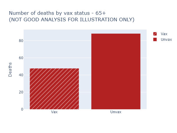
This looks like the vaccine only reduces the risk of death by half, much worse than we’ve been promised. Luckily, this is not the right way to think about it at all (and for that reason DHS doesn’t even display these numbers explicitly). It overlooks that nearly 90% of those over 65 are vaccinated, so these 48 vaccinated deaths are coming from a much larger group than the 88 not-fully-vaccinated deaths.
So here’s another plot that visualizes the data better. The height of the bar now indicates the rate of deaths per 100,000 people in each of the vaccinated or not-fully-vaccinated groups. The width of the bar indicates the population of the group. That means the total area of each bar is proportional to the raw number of deaths, but the height more accurately shows the risk reduction from vaccination. For this age group, this per-capita rate of deaths among the unvaccinated was 9 times higher than in the vaccinated.
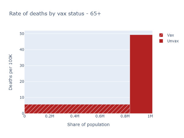
That big empty space above the vaccinated bar and left of the unvaccinated bar represents, plausibly, the number of deaths prevented by the vaccine in this age group.
Accounting for age
So now we know to always use per-capita numbers. Let’s look at deaths again (per-capita, of course) for the whole population.
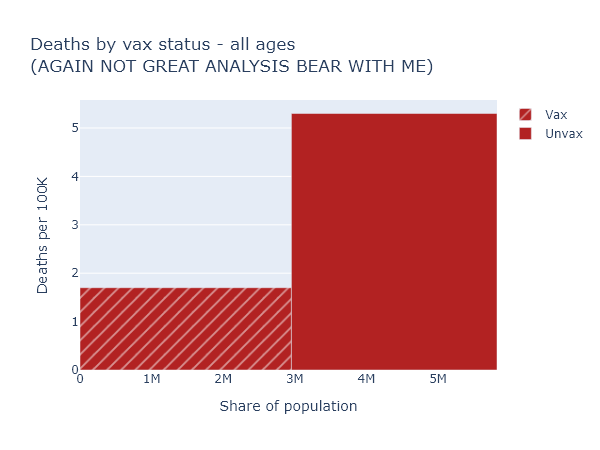
This is confusing again - the risk reduction here only appears to be a factor of 3. But that’s much lower than we just saw for the over-65, which we know is the group most at risk of death. How does that make sense?
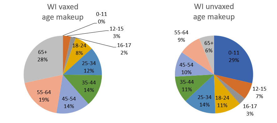
We have to realize that if we compare the vaccinated and unvaccinated for the whole population, these two groups differ in two ways that we know strongly affect the death rate: vaccination status, obviously, but also age. In Wisconsin over 80% of people over 65 are fully vaccinated, while zero people under 12 are. The age makeup of each group is very different:
This means you can’t make a good comparison across vaccination status without accounting for age.
To get some intuition for this, let’s imagine a simpler, more extreme situation. Imagine that our entire population was half kids under 12, who are all unvaccinated but still vanishingly unlikely to die; and half retirees over 65, who are 100% vaccinated but still have some likelihood of dying (albeit much reduced, say by 90%). In this population 100% of Covid deaths would still occur among the vaccinated, and 0% among the unvaccinated. But that would not be because the vaccines were ineffective. It would be because the elderly were both more likely to be vaccinated, and still more likely to die of Covid than the younger, unvaccinated group.
The real situation in our state and the country is not so extreme, but it has the same kind of pattern. To get an accurate picture of vaccine effectiveness, we have to separate out data by age group, or adjust for age in some way.
The data itself
Separating and adjusting for age is just what DHS has done in the latest data release, although I think there is some room for better visualization and explanation.
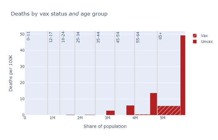
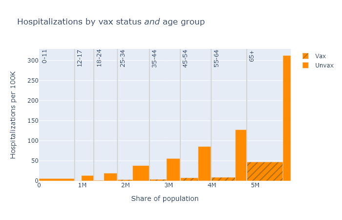
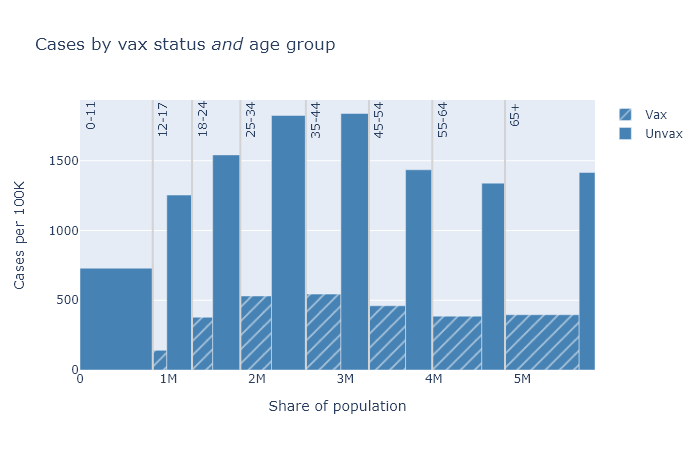
Below are three plots that show DHS’s August data for deaths, hospitalizations, and cases, separated out by age group. Again the height of each bar shows the rate of the outcome per 100k people, showing the risk for that vax and age group, and the width indicates the population of that group. The tall narrow bar for unvaxed deaths over 65 means the group is small and the risk is high; the wide short bar for unvaxed hospitalizations under 12 means the group is large but the risk is small.
A few points become apparent in these plots.
- Absolute risk (the height of the bars) for deaths and hospitalizations are clearly much higher for older people. Risk of getting a case is more roughly equal.
- The relative risk reduction (the ratio of the height of the unvax bar to the height of the vax bar) is pretty consistent across age. If you’re in your 30s or 40s, the absolute risk of death from Covid is not that high, but the vaccine makes you basically invincible.
- The protection against getting a case is clearly not as good as it is against death and hospitalization. But the vaccine still reduces your chances of getting a case by about three-quarters.
In this post I’ve been belaboring group size and age, but of course there are other possible factors to consider. The not-fully-vaccinated group includes people with only a single dose; people who have had Covid already clearly also have some immunity; maybe vaccinated people are still being more cautious on average; maybe vaccinated people are more (or less) likely to get tested and find a case. This profusion of confounders is the big limitation of observational data like this. Nevertheless, I think group size and age are big and basic, and as long as we take these into account we’re getting a pretty good idea of vaccine effectiveness.
Age-adjusted numbers
Finally, with this background I can explain DHS’s headline numbers from the first paragraph, which are “age-adjusted” estimates. As we have seen, the vaccinated and unvaccinated groups have different age distributions. Age adjustment uses the data we have to estimate what the total per-capita deaths would be if both groups had exactly the same age distribution as the population as a whole.
In math, for each age band, (adjusted vaxed deaths) = (observed vaxed deaths) × (fraction of total population) / (fraction of vaxed population). Then add them up and divide by the total population to get the adjusted deaths/100k. Then do the same for the unvaxed group data. This is not dark statistical magic. I reproduced the DHS’s numbers in Excel in about a half hour - an Excel sheet I’ll share with those hypothetical readers who would like to replicate it themselves.
For an individual, it’s more accurate to look at the age-specific numbers. But this age-adjustment procedure gives us the best single number for the risk reduction from vaccination, taking the population as a whole. It is also, I think, something we can fairly compare with the vaccine efficacy as reported in the original clinical studies, though it’s definitely not perfect.
Here is a table of these age-adjusted risk factors and vaccine efficacy values for each outcome, again based on this August data. The risk reduction is calculated as the age-adjusted, per-capita rate for the unvaccinated group divided by the rate for the vaccinated group. The vaccine efficacy is simply 1 - 1 / (risk reduction).
| Outcome | Risk reduction (age-adjusted) |
Vaccine efficacy (observed) |
|---|---|---|
| Cases | 4× | 75% |
| Hospitalizations | 9× | 89% |
| Deaths | 11× | 91% |
These efficacies are lower than what was originally reported in the clinical trials, which found about 95% efficacy for symptomatic disease (kind of the same as cases, but not exactly), and even higher numbers for severe disease and death. This data would seem to support the idea that some combination of the Delta variant and waning immunity has reduced the effectiveness of the vaccines.
But look, the effectiveness is still really good! The vaccines still work.
Acknowledgments
I’m indebted to the blog Covid Data Science for discussion of these issues and demonstrating how to do this analysis. Here are two relevant posts.
- A similar example from Israeli data of how failing to account for age can make vaccine efficacy appear lower than it is: Israeli data: How can efficacy vs. severe disease be strong when 60% of hospitalized are vaccinated?.
- A contrary example of how failing to take account of changes with time can make efficacy look higher than it really is: How time confounding can bias vaccine effectiveness upwards via Simpson’s paradox.