20 Feb 2021
This week three additional cases of the B.1.1.7 coronavirus variant were detected in Wisconsin. What is this variant, and what does it mean for Wisconsin?
The manxome foe
Beware the Jabberwock, my son!
The jaws that bite, the claws that catch!
Beware the Jubjub bird, and shun
The frumious Bandersnatch!*
The original coronavirus was bad enough (the Jabberwock = “Covid Classic”, obviously). But as soon as we thought we might have that one handled, new variants of the virus have sprung up to afflict us.
The first important variant is B.1.1.7, which became dominant in the U.K. and is thought to be more transmissible and possibly more deadly than Covid Classic. The second is B.1.351, which emerged in South Africa and is thought to less affected by existing Covid immunity. This means that people who have already had Covid can be more easily reinfected, and that the existing vaccines appear to be less effective to some degree.
(Clearly the Jubjub bird is B.1.1.7, since as a bird it travels more easily, and the Bandersnatch is B.1.351, “frumious” meaning “less affected by existing immunity.”)
So far B.1.1.7 is the larger concern. Since it is more transmissible, once introduced it should gradually out-spread Covid Classic. If B.1.351, in contrast, is not inherently more transmissible but is somewhat more able to reinfect those with immunity, this is not immediately as great an advantage. Once most people have some natural or vaccinated immunity, this variant will probably become the bigger concern. (Although Moderna and other vaccine makers are talking about preparing booster shots for it.)
He took his vorpal sword in hand;
Long time the manxome foe he sought—
How common are these variants right now? The CDC tracks all known cases in the United States by state. There are hundreds of known examples of B.1.1.7, but only a few of the others. California and Florida each have a few hundred known cases, and the other states only a smattering. Wisconsin has only had 5 known cases of B.1.1.7, and none of the others.
A recent preprint estimated the prevalence of B.1.1.7 in the United States and how fast it is displacing Covid Classic. They estimated that at the end of January, B.1.1.7 accounted for 2% of cases in the United States, and its share of cases was growing at 7% per day, which implies that it is about 40% more transmissible than Covid Classic.
A growth rate of 7% per day corresponds to a doubling time of 10 days, which sounds alarming. But it is important to note that this is the growth in share, the proportion of all Covid cases that are from this variant. The overall numbers of Covid cases will follow the Classic trend - which is decreasing - until the variant becomes a substantial fraction of total cases. At that time, we could see another wave as the variant’s increased transmission outweighs the our current resistance.
An uffish thought
So rested he by the Tumtum tree
And stood awhile in thought.
To see how this might play out in Wisconsin, I made a very simple model pictured below. I eyeball-fit a decreasing exponential curve to Wisconsin’s case trend since mid-January. (Decreasing 3.8% per day, or a reproduction factor of R=0.81, with a 5-day transmission interval.) I then assumed that prevalence of B.1.1.7 was 2% at the end of January, and that its transmissibility was 40% higher (so R=1.1, or increasing 2.7% per day). The sum of the two models the total Covid cases per day over time. Under these assumptions, the case rate would level off at the beginning of April and then begin to rise again, reaching a level comparable to today by June.
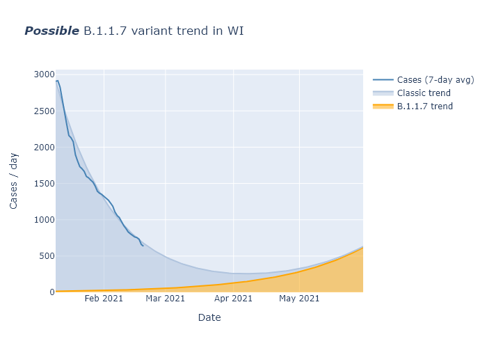
This is not a prediction, but an illustration of what might happen if current trends just continued indefinitely. The most important observation, I think, is that it shows that we probably still have many weeks before any return to increasing cases. In that intervening time, we have our own weapons to wield.
One, two! One, two! And through and through
The vorpal blade went snicker-snack!
First, every week almost two hundred thousand vaccines are getting administered. Over 10% of Wisconsin residents have had at least one dose so far, and if we maintain this pace another 10% should have one or two doses by the end of March. This will include a majority of people over 65. There will still be a long ways to go, but this is enough vaccination to further reduce transmission and to prevent a large proportion of the worst outcomes.
Second, I believe the virus must have a strong seasonal change in transmissibility, higher in winter and lower in summer. Every week that passes brings us closer to spring and lower transmission.
Finally, the B.1.1.7 prevalence may not even be as high as 2% in Wisconsin. The paper’s prevalence estimate for the United States did not include any samples from Wisconsin, because it was based on a single company’s data. But Wisconsin has been doing its own decent amount of coronavirus sequencing. We have found 5 cases of B.1.1.7, but that is out of thousands of samples. This article from mid-January reports 4400 samples; presumably it is higher now. A total of 5 positives out of probably more than 5000 samples would suggest a prevalence more like 0.1% at the moment, not 2%. That buys us even more time.
So overall I am optimistic that vaccines and seasonality will win the race against B.1.1.7 in Wisconsin, and things will be mimsy again…although of course there is still much uncertainty.
’Twas brillig, and the slithy toves
Did gyre and gimble in the wabe:
All mimsy were the borogoves,
And the mome raths outgrabe.
07 Feb 2021
Indicators are pretty good! Vaccine administration has started picking up, reaching a substantial fraction of people over 65. I am concerned about uneven distribution between regions of the state, though. Cases and positivity rate continue steadily decreasing, making me optimistic despite the Covid variants abroad.
Vaccinations
I wish vaccine distribution was going faster, but I have been encouraged that in the last two weeks (since the 65+ group was given the green light), rates of vaccination have gone way up.
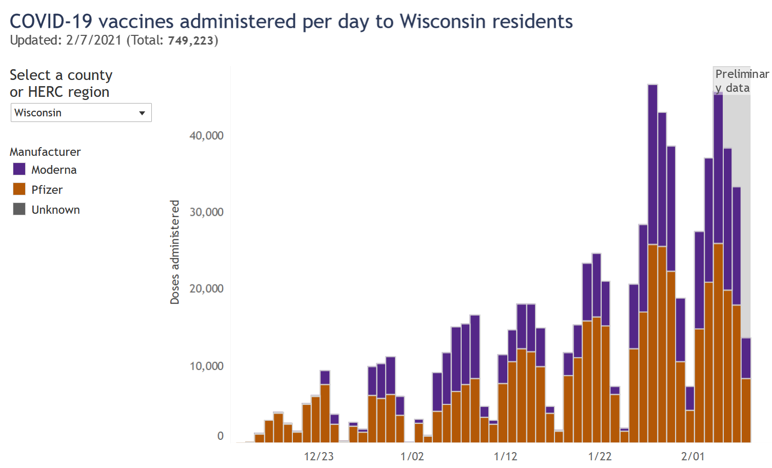
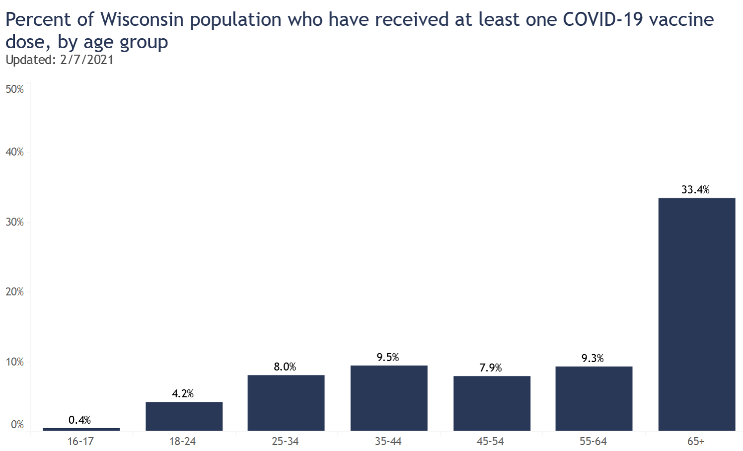
This data comes from the DHS vaccination page. The proportion of people 65 and over who have received at least one dose has now reached 33%. Really that’s decent progress. If this rate continued we would see 75% vaccination for the 65+ group by the end of the month.
I am concerned, however, that Milwaukee County has administered fewer doses than Dane County despite having almost twice as many people. Here is a bar graph of all the regions in Wisconsin and their number of vaccinations per 100 people. (For definitions of these regions see the bottom of the regional dashboard.) This is not the same as percentage of people vaccinated, since some of these vaccinations are second doses.
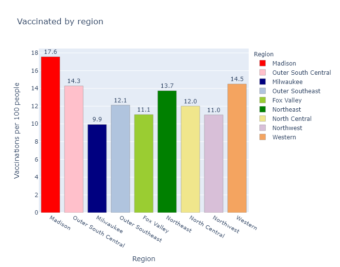
Madison (Dane County) is the best and Milwaukee County is the worst; other regions are in between. The fact that Dane County ranks first makes me wonder if Madison vaccinators may be getting more favorable vaccine allocations due to better knowledge and communication with the state bureaucracy. But the fact that Milwaukee ranks last makes me wonder if Milwaukee is doing a bad job on distribution. The DHS does not publish data on the allocation per county, unfortunately, so I can’t do more than speculate.
A more benign possibility is that the discrepancy relates to the demographics of the regions; I would expect the vaccine numbers to be higher in regions with more health care workers and people over 65. But I don’t think that solves the Madison-Milwaukee dichotomy, because I would think that both counties have more health care workers but fewer older people, per capita, than the rest of the state.
Part of the explanation could be that more of the Milwaukee metro area’s health care workers and older people live in suburbs in the surrounding counties. If I include the suburban WOW counties (Waukesha, Ozaukee, Washington) with Milwaukee, the metro area as a whole comes up to 11.4 vaccinations per 100 people, more in line with other areas of the state. But this still does not explain Dane County’s over-performance.
I hope to figure out a more complete explanation, or better yet, that the discrepancy eventually evens out.
Infections
Cases and positivity rate continue their steady downslope, looking the very picture of exponential decrease. (Meaning that if infections decrease, say, 15% every week, the curve will start out steep and flatten over time as it approaches 0; the opposite of exponential growth that starts out flat but quickly accelerates.)
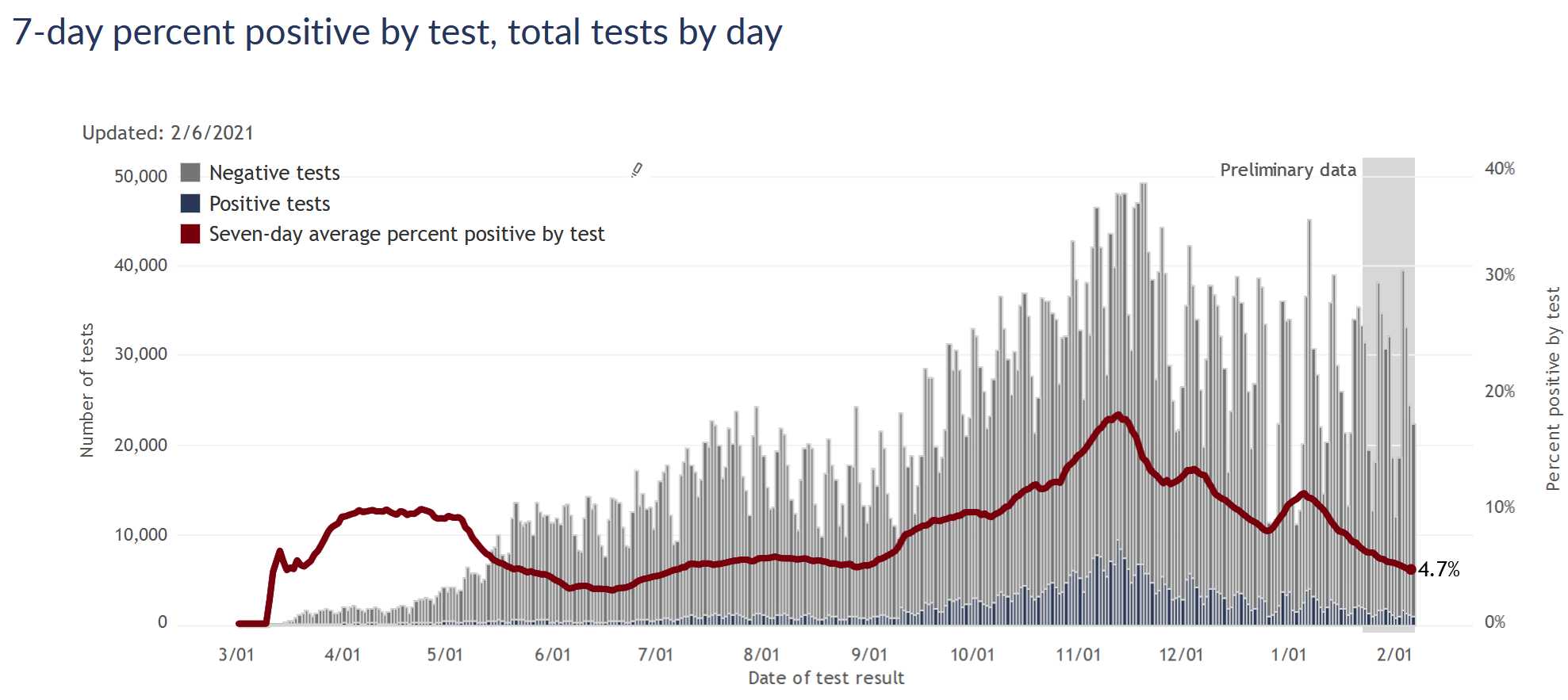
Some authorities warn that we’re not testing enough, but I think that’s unfounded. Testing numbers are going down, but I think at this point that’s a natural part of the surge cycle. Once infections are decreasing, there are fewer people with symptoms and contacts who need to get tested, so demand for testing goes down as well. As long as the test positivity rate is also going down or at least remaining steady and low, it doesn’t seem worrisome to me.
A side benefit of the lower testing demand is that response times have improved. I was tested several weeks ago and got the results by the end of the next day; the Milwaukee County dashboard indicates that nearly 100% of tests are returned within 48 hours.
Extrapolating the current case and positivity declines forward to the end of the month would bring the state about back to where we were before the fall surge, at the beginning of September.
The coronavirus variants are out there, so I think it behooves us to remain cautious and vigilant. But indicators are pretty good right now, and I am still optimistic about beating the virus by the summer.
30 Jan 2021
Prisons are not a good place to be in a pandemic. More than 10,000 - over half - of Wisconsin’s prisoners have caught coronavirus, in addition to over 2000 staff. Obviously being confined in close quarters is not a good starting point, but I think the data suggests that Wisconsin prisons could have done a lot better.
The system as a whole
The Wisconsin Department of Corrections operates 37 prison facilities. It also maintains a small percentage of prisoners at contract facilities, such as county jails. In total, Wisconsin’s prisoner population is about 20,000 people (according to the DOC’s weekly population report). This number only counts people under the care of the Department of Corrections, so it does not include federal prisoners or many in county jails, such as those awaiting trial. From a 2019 demographic report, prisoners are about 95% male, with a median age of 39.
The DOC provides data for its facilities on a pretty comprehensive Covid dashboard. Total numbers are summed up in the table below.
| Population (DOC facilities) |
19,271 |
| Confirmed cases |
10,557 |
| Total tests |
85,970 |
| Case % of population |
55% |
| Deaths |
25 |
| Case fatality rate (CFR) |
0.24% |
If I am interpreting the numbers correctly, more than 50% of all prisoners have been infected. I’m sure there have been some number of undetected infections as well. But the total number of tests is pretty high, enough for each prisoner to have been tested four times or more. So I would guess that the DOC is detecting most of the infections.
In the general population, in contrast, the cumulative number of tests stands at about 1 per person, and the case numbers may understate the true infections by a factor of 3 or so. Using that estimate, if about 30% of Wisconsin has had the coronavirus, then prisoners have had about double the risk of catching Covid as the average resident.
As for risk of death, the prisons’ CFR of 0.24% is perhaps a bit higher than what I would expect, based on data from the state as a whole. I only know prisoners’ median age of 39, not their distribution, but let’s crudely assume they’re evenly distributed between ages 20 and 59. Then using the CFR table from my previous post on age, I would predict a CFR of 0.15%. So it would seem that prisoners’ risk of death after catching Covid may be somewhat higher than the general population. This could be an illusion due to the crude estimate; because they’re mainly men, who have a higher mortality rate; or I imagine because of worse average health and medical care.
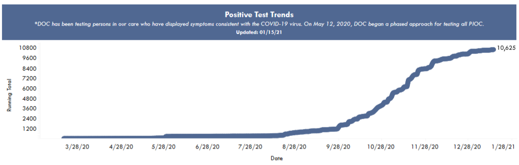
In contrast to prisoners’ divergent risks of catching and dying from Covid, the timing of prisons’ outbreaks was just the same fall wave that hit the state as a whole. The following plot of cumulative cases is from the DOC’s dashboard, and shows the most rapid case growth in October and November.
Comparing individual prisons
To compare the performance of different prisons, I matched Covid numbers from the DOC dashboard with prison populations to calculate a fraction infected for each facility. In the following map, I show a bubble at each facility’s location. The outer bubble size is proportional to the prisoner population, and the inner bubble is proportional to the number of Covid cases. Each bubble’s fill percentage, then, shows the case percentage in that prison. All the prisons are shown here, but I left labels off some smaller ones for the sake of readability.
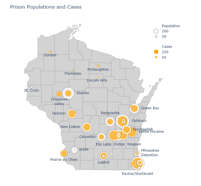
An interactive version of this map is available at my new Prisons dashboard page, along with a table of all the DOC’s prisons and their Covid numbers. The table is sortable, so you can find out which prisons have the highest cases, deaths, or case percentages.
There have been a number of times over the fall when I noticed that a particular county had a puzzlingly high case rate. Always, as I dug deeper, I would find out it was because a large prison had tested everybody and added hundreds of cases to the county numbers. Dodge County is a good example. It had higher numbers than its neighboring counties throughout November, but this was partially because it contains three of the largest prisons in the state. Those three prisons alone - Fox Lake, Dodge, and Waupun - account for 22% of that county’s positive cases.
Few prisons have kept their case percentage low, but there is some variation. Perhaps the worst performer has been Kettle Moraine in Sheboygan County, which has had almost 900 cases and a case percentage of 83%. Not surprisingly, there have been reports of poor pandemic management. In contrast, Stanley in Chippewa County has a case percentage of only 28%.
It would be very interesting to compare infection control practices at Kettle Moraine and Stanley, or at WSPF (Wisconsin Secure Program Facility), which is almost Covid-free. Did the prisons with relatively low case rates do anything different, or did they get lucky?
Or are there any obvious correlations in the data? One possibility could be the size of the prison; so let’s plot case percentage against population:
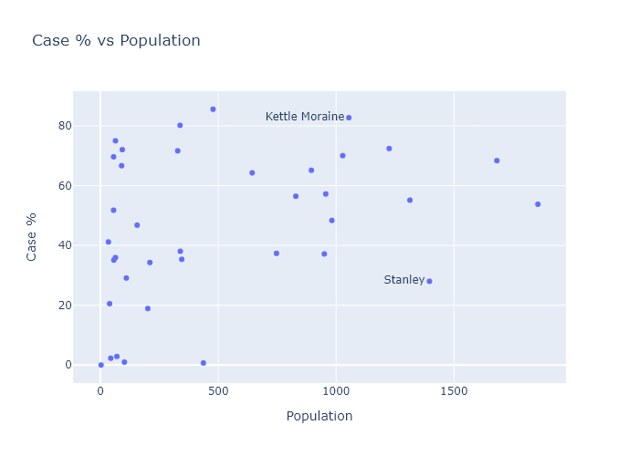
The predominant relationship here seems to be that there is just more variation in the smaller prisons. TThis makes sense; with smaller numbers comes more randomness. The larger prisons almost all converge to an over-50% average.
Another possibility could be crowding. More social distancing and better quarantining might be possible in less crowded facilities. The population report I mentioned earlier also contained data for each facility’s design capacity. So I can plot case percentage versus “overcrowding,” the ratio of a prison’s current population to its design capacity. There seems to be a small but noisy correlation here.
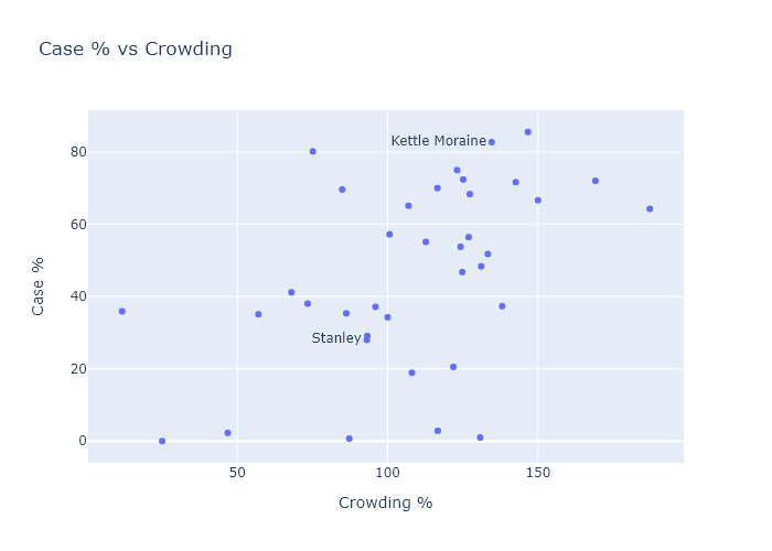
This suggests that two ways of reducing Covid risk could have been to expand facilities, or to have expanded compassionate release of certain prisoners, such as the elderly or those with little time left in their sentences.
My wife is a public defender. Back in the fall she won a case for compassionate release of a man in federal prison, due to his health and elevated risk from Covid. (I created a graph for her brief; she tells me lawyers are dazzled by Excel plots.) Unfortunately, compassionate release is harder for state prisoners, and from what I can glean it doesn’t seem like it has happened much at all. This article from August cites 131 applications and only 2 releases - out of, remember, 20,000 prisoners.
I think the data vindicates the advocates of compassionate release. Every person released before the fall wave would have been spared a very high chance of catching Covid. And by reducing crowding, they probably also would have reduced the risk for the remaining prisoners (and guards!). The DOC clearly didn’t have any better plan in place.
24 Jan 2021
Now that data has fully filled in for the weeks following Christmas, it confirms that the Christmas case bump was indeed temporary, and Wisconsin has returned to a gradual downslope of infections. I expect this trend to continue, although it is possible the new virus strain will arrive to interrupt it.
So this is Christmas (bump is over)
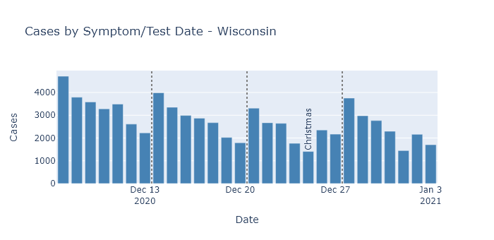
Daily cases by test or symptom date started increasing after Christmas, reached a peak about a week into January, and have been declining since.
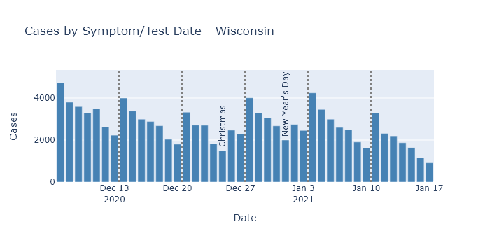
As in previous posts, I am displaying the cases by test or symptom date, instead of reporting date, to avoid any effects from reporting delays. (For example, death reporting is now running way behind the actual date of death.)
To check whether this pattern may be due to changes in testing, rather than infections, we can again look to Milwaukee County, which publishes both cases and tests by test date. (The state publishes test numbers only by result and report date, not test date.)
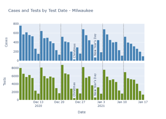
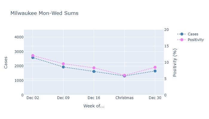
Milwaukee shows a similar increase in cases after Christmas. As for testing, the holidays themselves have lower numbers but the other days around them are pretty consistent. So I’ll sum only the consistent Monday through Wednesday numbers and plot cases and positivity rate together.
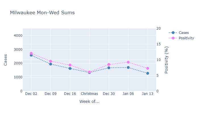
Both measures increased after Christmas, and continued going up a bit in the week after New Year’s Day. After that, though, they resumed their decrease on about the same slope as before the holidays.
So this data shows that Christmas caused a modest but temporary bump in the number of infections, because (I believe) activity around the holidays was also only temporary.
The outlook for Wisconsin
I expect the gradual downward trend in infections and deaths to continue, possibly until we have mass vaccination and the pandemic is effectively over. Our current combination of partial population immunity, prevention measures, and now vaccination is strong enough beat the virus back. There are a few possibilities that could still interrupt this path, however.
The first possibility is that when colleges go back into session this week, it will cause a spike in cases similar to what we saw in the fall. As long as this spike is confined to college campuses, though, I don’t think it’s something to greatly worry about. I mean, Tommy Thompson and Becky Blank should worry about it, but based on the fall I think it’s unlikely to kick off a wider increase in spread.
The second, more dangerous possibility is the arrival of a more transmissible coronavirus strain to Wisconsin. One strain, B.1.1.7, has become widespread in the U.K., and scientists think that it is responsible for a fast rise in cases even in the face of strong restrictions on activity. This new strain has been detected in the United States, but is probably not yet widespread. If it were to get a foothold in Wisconsin, its higher transmissibility could return us to increasing infections.
If this were to happen, my guess is that we would see the effects in Milwaukee and Madison first, just as those areas saw the first major outbreaks of the original coronavirus. The new strain would have had to arrive here from somewhere, and that is more likely to happen in larger cities with more frequent travel out of state.
So far, however, I see no signs of an outbreak of the new strain here. So my hope is that more vaccinations, and spring, arrive before it does.
09 Jan 2021
Early returns show that Christmas did indeed lead to an increase in spread. I predict and hope that this spurt of cases will be temporary, as it was for Thanksgiving, but we will need to wait one or two more weeks to know if that happens.
The moon is right, the virus up
The daily reported case numbers are increasing in Wisconsin.
But in a similar situation to Thanksgiving, it is hard to know how much of this pattern is due to increased spread during the holiday leading to more cases afterwards, and how much is due to lower testing and delayed reporting leading to fewer reported cases during the holiday. To find out, this post will look into the same data by test date that I did in my Thanksgiving post.
Here are Wisconsin cases by date of test or symptom onset for four weeks around Christmas, excluding the most recent week because data is not complete yet. Since it is plotted by test or symptom date, it is easier to interpret than the report-date data. There is clearly a modest rise in the number of daily cases in the week after Christmas.
DHS does not publish numbers for tests by test date, so there is no easy way to adjust this for the number of tests being performed. The number of tests in the weeks around Christmas and New Year’s was probably lower than the previous weeks. So while this test-date data avoids confusion from delayed reporting, it is still difficult to say whether this trend is a real increase in virus, or an artificial dip due to lower testing around Christmas.
But Milwaukee County, my favorite county, does publish cases and tests by test date, so we can get a better idea for that county in particular.
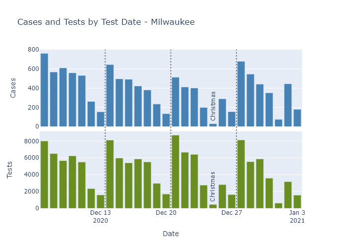
There is a dropoff in case and tests on the holidays themselves: Christmas and New Years Days, and to a lesser extent their Eves. But the other days of the week are fairly consistent week to week. So I can compare cases and test positivity rate averaged over Mondays through Wednesdays, just as I did for Thanksgiving.
Both cases and positivity rate went up in the week after Christmas, breaking the downward trend from the prior weeks. When both these measures go up at the same time, I think it means that true infections are also going up.
Simply having a temporary Covid spike?
As long as the Christmas holidays only caused a temporary increase in activity, though, I expect the numbers to start going down again in the next week or two, just like they did after Thanksgiving.
Provided they do, I find this pattern of temporary spurts somewhat encouraging, actually. I believe it demonstrates our (admittedly limited) ability to control the virus. For the last several weeks, Wisconsin’s current combination of activity level and partial population immunity has been sufficient to put infections on a downward trend. When activity increases, as at Thanksgiving and Christmas, then infections start increasing too. Our population immunity is only partial; it’s only enough to prevent spread in the context of our current activity level and preventive measures.
But when the holidays end and we reduce activity again, infections decline again as well. With all that this virus has done to surprise us, I take a little comfort that this pattern seems almost…predictable. Of course, this all assumes that cases do go back down again in the next two weeks, and the virus doesn’t decide to prove me wrong.
