19 Oct 2020
The DHS did not put out any data updates this weekend, because of computer system maintenance. (Seems like a bad time?) I decided to use this time of mystery and uncertainty to address another unknown number, the true number of infections in the state.
It is well known by now that the number of cases, infections confirmed by a positive Covid test, do not capture all of the infections in the state. Some people may be asymptomatic, some people may be sick but not get a test for various reasons. Early on, one large study estimated that only about 1 in 10 infections were actually being detected as confirmed cases. That study did not look at Wisconsin, however. It was also for a period of very limited testing; we are certainly catching more cases now.
So what is the current true number of infections in Wisconsin?
Let me just tell you the answer
Here’s one way to get an estimate of the true number of new infections per day.
- Take the 7-day average of new cases.
- Multiply by 1.5 (or 2).
That’s it!
I think this is a plausible estimate for case numbers right now, based on a few approaches I will go on to explain. Each approach is a little evidence, a little guesswork.
Antibody testing
The best evidence would be to test everyone in the state every day. The second best evidence would be to test a representative sample of people. But the test data DHS reports every day is not representative; after all, people go get tested because they think they might be infected! This biases the data towards positive results. The “positivity rate” we see is the percent of people who get tested that have the virus, definitely not the percent of the general population.
Luckily, more representative evidence has recently come in. Two weeks ago the Journal Sentinel and others reported the results of a Covid antibody study conducted by the Survey of the Health of Wisconsin, a research effort at UW-Madison. They tested about a thousand people from July to mid-August for coronavirus antibodies, which would show that they had been infected and recovered. These studies, also called serosurveys, have been performed elsewhere but this is the only one I know of in Wisconsin. If they are properly randomized and representative, these studies can give an estimate of the proportion of people in the state that had ever been infected at the time of the study.
This study found that an estimated 1.6% of Wisconsin residents had been infected as of July and August, when they took the blood samples for the study. That would be 93,000 people. The CDC says it takes 1-3 weeks after an infection for antibodies to show up, so to compare to the number of detected cases we want to look at late June. The cumulative number of detected cases then was about 30,000. So up to that point we were detecting 1 in 3 infections. This would actually be pretty good compared to other places. And if we were detecting 1 in 3 infections in the spring and summer, we are very likely detecting a higher proportion now.
There is a lot of room for error here, unfortunately. I have not been able to find a more formal writeup of the study, so I don’t know things like how representative their sample was. I also do not think scientists are certain about the false positive or false negative rates of these antibody tests - do all infections produce detectable antibodies, or only a certain percentage? But it is good to have this data in any case, and it is broadly consistent with what I think we know about the virus.
Cases and tests
This antibody data tells us the true infection rate for a period of time, but only months after the fact. It does not help us react to new data. For example, when I hear that cases are increasing, does that mean the virus is spreading (bad), or that testing is increasing (good)?
This question is why the DHS and everyone else also reports the test positivity rate, which is just the number of positive cases divided by the number of tests. (This sounds simple but of course is actually super complicated, which I have a previous post on.) If cases are going up and the positivity rate is going up, then it is not just an artifact of increasing tests and the virus is spreading. Conversely, if they are both going down, then the virus level is going down. If one is going up and the other is going down, then it is ambiguous, and virus activity is maybe just roughly the same.
To get any more specific and quantitative, you have to make assumptions and come up with some kind of model. Many people have tried this - here is Our World in Data comparing a few of them, and here is another that has estimates for Wisconsin specifically.
For the rest of this post I am going to share an idea I came up with - because it’s my blog - so you should probably go on dilettante alert. I do really think my idea strikes a good balance of simplicity and plausibility that I have not seen elsewhere. But then I also think all my kids are above average and that my college rock band had a shot at the big time.
Anyway, here is my formula.
\[N_{inf} = k \times \frac{N_{cases}}{\sqrt{N_{tests}}}\]
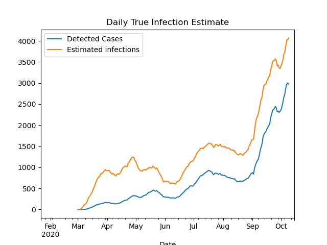
where \(k\) is a constant, \(N_{cases}\) is the number of daily cases, and \(N_{tests}\) is the number of daily tests. At some point I will write up my thinking behind this formula, but I do not want to bore anyone with it now. Using the antibody study discussed above to calibrate the constant, I get \(k=240\), and the resulting estimate over time is plotted below.

With this model, I estimate that the ratio of true infections to detected cases was about 6-to-1 in April; down to 2-1 in June; and only 1.4-to-1 today. That last ratio is a bit low compared to other models, so ultimately I would guess the ratio right now is between 1.5 and 2.
To be continued…
I will stop the post here, but there is more to say on this topic. In a future post I will try to estimate true infections from deaths, and show how that estimate broadly fits in with the estimate in this post.
11 Oct 2020
What is happening right now with Covid in the state? It can be hard to piece together an overall picture from hearing the daily headline numbers, or reading news stories with different national or local framings. So in this post I will try to give a status update for the state, as I see it.
Cases have plateaued overall - but are still rising for older people
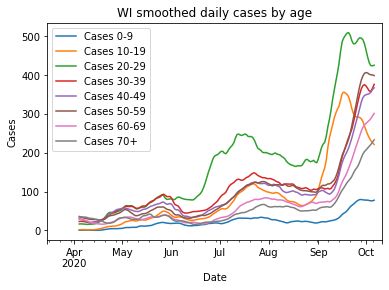
The number of new daily cases has possibly peaked or plateaued, which is obviously good news. That news is tempered, however, when you look at the age distribution. Only the age brackets 10-19 and 20-29 age brackets are strongly decreasing, while higher-risk ages 30+ have either only flattened or are still going up.

Deaths and hospitalizations are still up
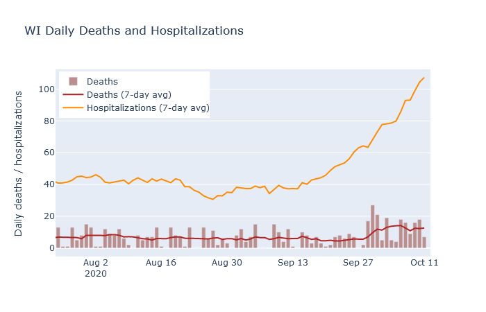
Deaths have averaged between 10 and 15 per day, matching my prediction from last week. Unfortunately, hospitalizations have continued increasing rapidly, so I would expect the death rate to increase further in the next week or two.

The Northeast
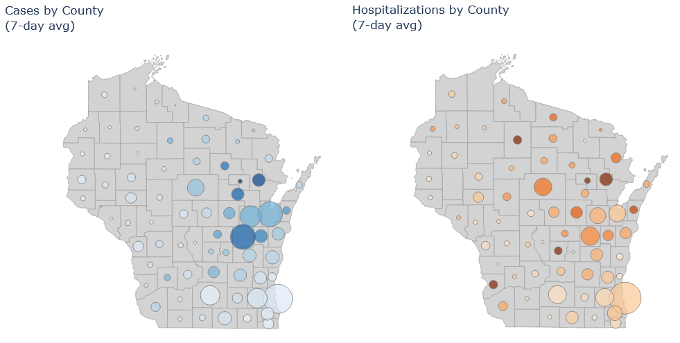
The northeast is still the state’s hotspot. Brown (Green Bay), Outagamie (Appleton) and Winnebago (Oshkosh) counties all have high numbers of cases and hospitalizations. Some smaller counties in the vicinity, such as Shawano, Oconto, and Menominee, have even worse numbers on a per-population basis.
The two maps below are new on my Dashboard page. The size of the circle is the average number of cases/hospitalizations in that county, and the color is cases/hospitalizations per population. So at one glance you can get an idea of both the absolute numbers and the intensity of the pandemic across the state.

Milwaukee
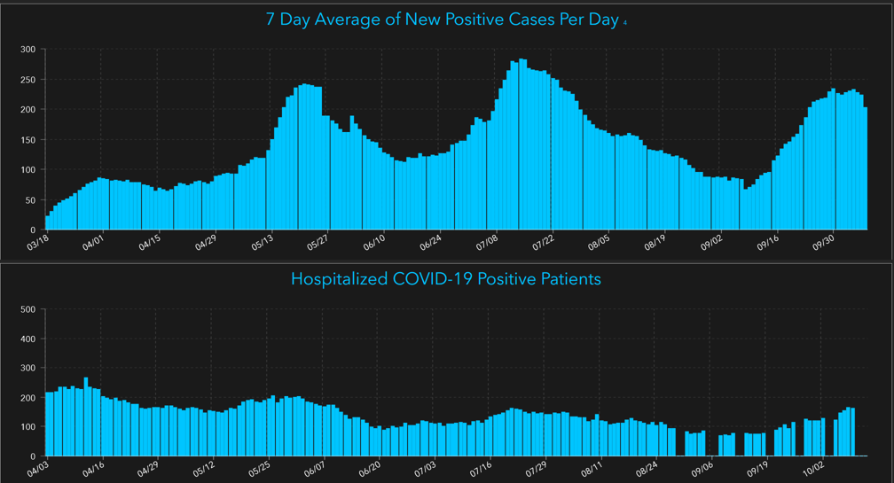
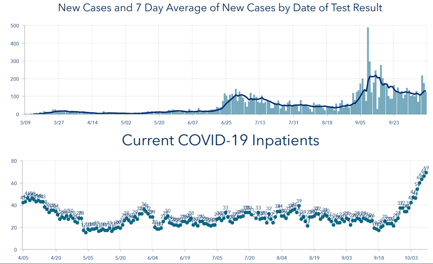
As for the other two major population centers, I think Milwaukee and Madison are both of moderate concern. Milwaukee cases and hospitalizations have been rising, but at a moderate pace comparable to the upswing in late summer. Clearly we don’t want it to get worse, but the situation is not as bad as in the northeast. The plots below are from Milwaukee County’s dashboard (because DHS changed its data download format on me and I haven’t fully updated my code yet, grumble grumble…).

Madison
Madison appears to have its campus outbreak under control, but cases have plateaued at a higher level than they were before the outbreak, and now hospitalizations are rising fairly quickly. Two weeks ago I was impressed that the campus outbreak seemed to have been contained to young people, but now it appears it may have spread more widely. (Update: Dane County Public Health has a blog post with more details. It is also possible that the college cases weeks ago and the hospitalizations now are actually unrelated; it is hard to have strong evidence one way or the other.)

So while the spotlight is rightly on the northeast, those of us in Milwaukee and Madison should be watchful as well.
04 Oct 2020
After two weeks of steeply rising hospitalization numbers in Wisconsin, the past several days have now seen deaths begin to rise. This should not be a surprise, unfortunately. While the number of cases does not always correspond to future deaths, the number of hospitalizations has been a fairly reliable predictor.
There are two well-known reasons that higher numbers of cases may not necessarily lead to higher numbers of deaths. The first is that only a fraction of the true infections in the population end up being confirmed as a case by a positive test. Therefore the availability and use of testing strongly affects the case numbers, sometimes independently of the true trends in infections.
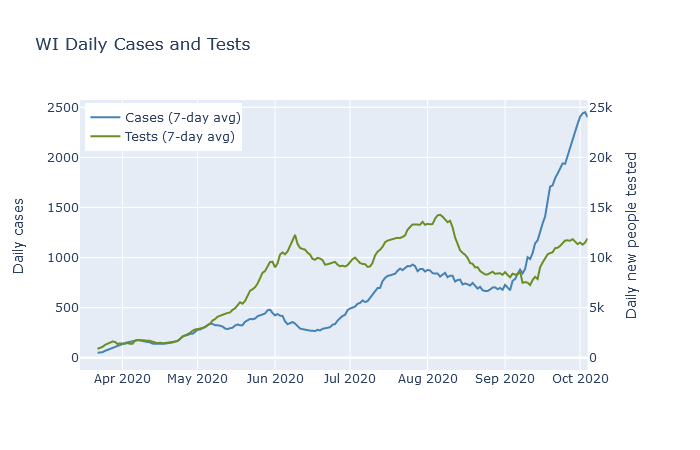
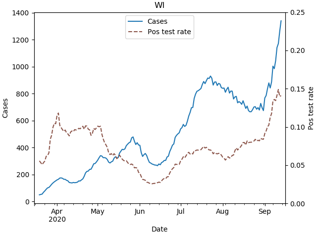
The plot below shows 7-day averages of daily cases and daily first-time tests, on separate y-axis scales. The test axis is 10 times the scale of the case axis; if the lines are level with each other, then the test positivity rate is 10%. The case rate was higher in May and June than it was in April, but the testing rate was far higher yet. The higher case rate in May and June reflected a higher detection rate, but possibly not a higher infection rate.

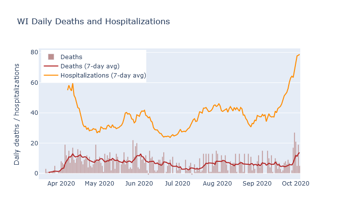
The second example where cases may not always lead to deaths is when those cases are concentrated in lower-risk young people. There was a modest surge in cases in Wisconsin in July and August that was led by people in their twenties. As shown in the next plot, deaths did rise as a result, peaking at a rate of about 8 per day in early August. But this was lower than the previous peak of 12 deaths a day in late May, even though the July-August case rate was twice as high!

Hospitalizations, in contrast, have had a much more stable relationship to deaths. In addition to deaths, the plot above also shows 7-day averages of daily deaths and daily hospitalizations. Note that these are daily new hospitalizations, which are easier to relate directly to daily deaths, not current patients. The rate of deaths has followed the rate of hospitalizations with more or less a two week lag, and also a pretty constant ratio.
Hospitalizations are a better predictor of deaths because they are less affected by the two reasons that cases are a poor predictor. Tests have always been prioritized towards hospital patients, so their test usage has been more consistent than the rest of the population. And hospitalized cases are naturally skewed toward the older demographics that are more likely to die. Outbreaks that are largely contained to young people, like the ones on college campuses, have not caused very many hospitalizations, and therefore have not caused many deaths either.
So what should we expect for deaths in the next week? At this date, DHS reports a total of 1377 deaths and 7646 hospitalizations, for a death-to-hospitalization ratio of 18%. Purely by eyeballing the graph, it seems that ratio may be decreasing slightly over time, so let’s estimate right now the ratio is 1 in 6. As of this writing, new hospitalizations are averaging 75-80 per day. At that hospitalization rate, we can expect the death rate to continue at 10-15 deaths per day, equal or higher to the death rate back in April. If the hospitalization rate has not yet peaked, then I expect deaths to go higher as well.
To me, the plots in this post are helpful in comparing the various headline numbers, and for assessing the state of the pandemic in a broader context. I am now posting interactive versions of them in the new Dashboard section of this site, where I will try to update them every day. The data, as for most of my analysis, is downloaded from the Wisconsin DHS.
26 Sep 2020
Wisconsin has two outbreaks. The first is on college campuses. Cases exploded after classes began, especially at UW-Madison and UW-La Crosse, but at many other campuses as well. Dorms are quarantined, students are rushing to buy ramen before lockdown, and I get to tut-tut to myself about the party kids in Sellery and Witte.
But while this outbreak has possibly already peaked - at least at Madison, though not yet at Marquette and UW-Milwaukee - a second outbreak is underway in the northeast corner of the state. I believe this second outbreak is more serious, although I think it has received less media coverage. It comes with a rapid increase in hospitalizations due to (I’m guessing) less of a skew towards young people. Wisconsin is at a record high for current people hospitalized - 574 at this writing - and this outbreak is what is driving that trend.
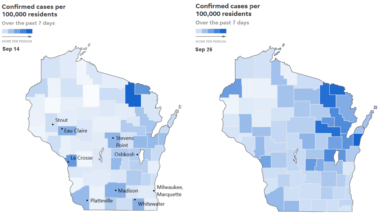
As you look at the case map of the state, over time, the succession of these two outbreaks stands out. Below are screenshots of the Journal Sentinel’s map tracker, taken on September 14 and September 26. They show 7-day case counts, per population, by county. Two weeks ago counties with large colleges stood out strongly. Today, in late September, they stand out much less and Green Bay and the Fox Valley are clearly the epicenter.

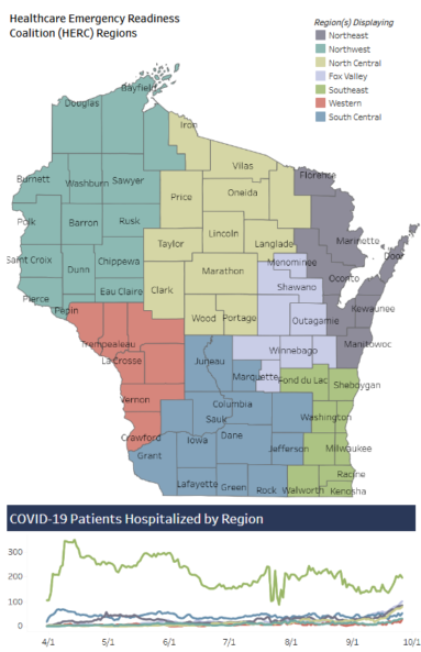
The situation is worse when looking at hospitalizations. The Wisconsin DHS has a hospital dashboard by region, which shows the number of currently hospitalized patients in 7 regions of the state. A screenshot of this dashboard is below.

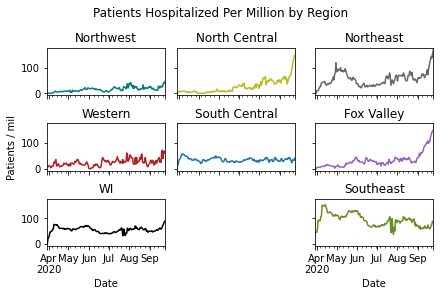
The Southeast region around Milwaukee is more populous, however, so it dominates the plot too much. So I broke out the data for individual regions, and scaled it per population. Covid patients in the Northeast (Green Bay), Fox Valley, and North Central regions are spiking, in correlation with these regions’ fast-growing case trajectories.

Comparing with the South Central region, centered on Madison, raises an important distinction. UW-Madison’s student outbreak has not led to large growth in hospitalizations, at least not yet. North and Northeast WI, we can see, is a different story.
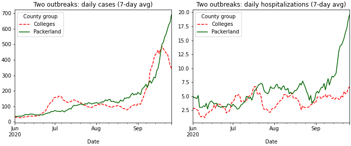
Finally, we can compare college counties and northeast counties directly. I picked seven counties with relatively large schools, and where I think the school is likely driving the Covid numbers: Dane (Madison), La Crosse, Eau Claire, Walworth (Whitewater), Grant (Platteville), Dunn (Stout), and Portage (Stevens Point). I did not include Milwaukee or Brown (Green Bay), because I think their dynamics are different at the moment. I then compared this collection of counties to the combined Northeast and Fox Valley regions in the DHS’s hospital map.
These two aggregates have have very similar total populations, about 103,000 for both. In the plots below, which show average daily new cases and average daily new hospitalizations, respectively, the two collections of counties are labeled “Colleges” in Wisconsin red and white, and “Packerland” in green.

For cases, the college counties shot up fast about three weeks ago, but have actually turned a corner recently and started coming back down. In Packerland, unfortunately, cases are still going up. The college counties also show a significant bump in July, when 20-somethings drove an earlier wave, that is not visible for the northeast.
The hospitalizations trend is even more consequential. The college counties show some increase but not a strong one, at least not yet. I take that as a hopeful sign that those outbreaks were somewhat successfully contained to the college students. The northeast counties, on the other hand, have just about tripled their daily hospitalizations over the last month. It seems likely that the outbreak there must be more widely spread among age groups to result in these hospitalizations, and that it is the result of more general community spread rather than being only driven by colleges.
The college counties just might have gotten their outbreaks under control. We will see if that holds. The northeast is now more serious, and I hope it gets more attention.
UPDATE: Two days after this post, the Milwaukee Journal sentinel published a story with very similar conclusions, including evidence that hospital capacity in the northeast is starting to fill.
21 Sep 2020
The Covid positivity rate in Wisconsin is now higher than it’s ever been. We are averaging 1800 cases a day, but with tests per day stuck at 10,000 or so. We know cases are high largely because of college campus outbreaks, but why is our testing so low?

The answer is that the number of tests being performed is not actually that low; in the past week it has actually sometimes approached 30,000 tests in a day. But in the way that Wisconsin reports the data, the headline is not actually the total numbers of positive and negative tests, but instead the number of new individuals testing positive and negative. Repeat test results, whether positive or negative, are not counted. So number of tests does continue to rise in the state, but since more and more people have already been tested at least once, the number of new people being tested is significantly lower.
I think this reporting convention is justifiable (a point I’ll return to below), but it’s important to understand if you’re looking at the data in detail.
The data in detail
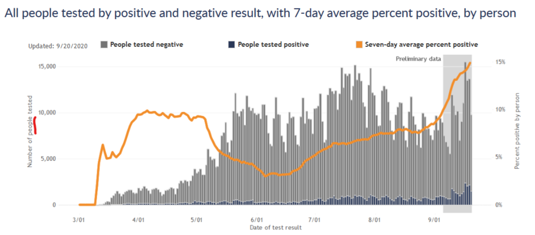
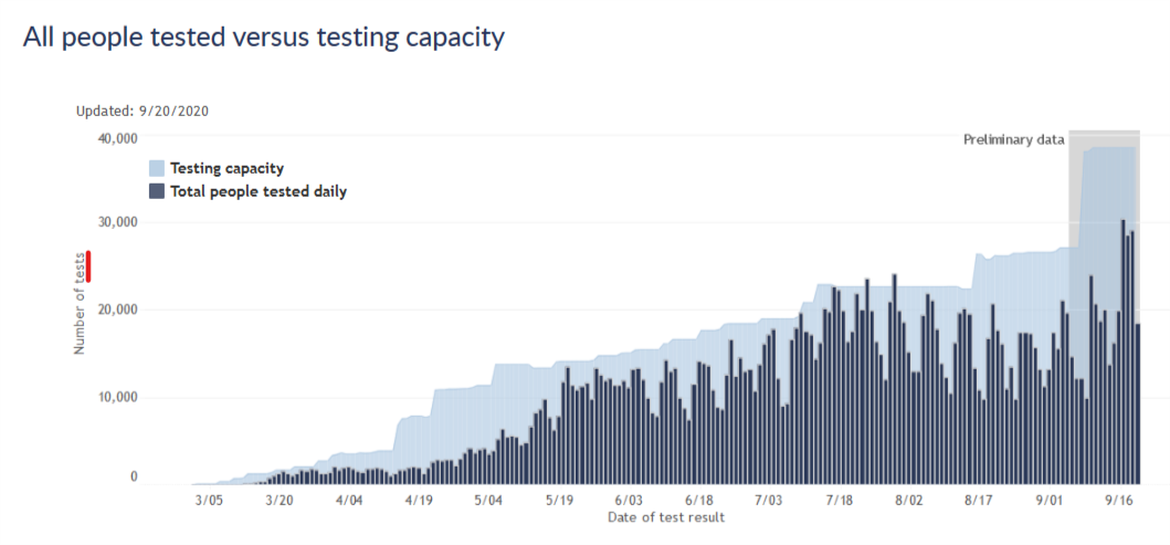
Beyond their headline numbers, the DHS does share data for both people tested and total tests. The next two plots are copied from the Wisconsin DHS Covid website.


The first plot is for number of new people tested, the same convention as their headline numbers. The DHS website notes for this plot that “If they tested positive more than once, they are only included once on the date of their first positive test result. People who tested negative and never positive (gray bars) are counted once on the date of their first negative test result.”
The second plot is for total number of tests, and compares this number to the state’s testing capacity. According to the site, “In this graph, people are included once for each time they are tested. If people tested positive or negative more than once, they are included and counted each time, on the date the testing lab reports their test result. Rarely, people may have multiple specimens, or swabs, collected at a single visit. Each of those specimens will use up some of our labs’ capacity. The total number of tests done may be greater than the number of people tested.”
These two plots give somewhat different impressions of the testing situation in the state. In terms of new people tested, we had a peak testing rate in mid-July, after which testing declined significantly, and it is only just now starting to get back to the mid-July level. I think this has generally been the narrative I’ve seen in the media, and it naturally raises questions. Why did testing decline in August? Why has testing capacity not improved since July so that we can better meet the current wave of cases?
The plot for total tests answers those questions, however. By this measure, testing did decline in August, but not by very much. And testing capacity is, in fact, considerably higher right now than it was in July. I think this shows that nothing is really going wrong in the state’s testing situation. Capacity has continued to increase gradually, though perhaps not as fast as we’d like, and now tests are rising to meet the surge in cases, though not fast enough to keep pace. This pattern is very similar to earlier phases of the pandemic.
The effect on positivity rate
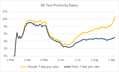
The plots above also show that the total number of tests is about twice the number of new people tested, which tells us that about half of all tests are repeats on previously tested people. If the DHS used total tests as the denominator for its test positivity rate, intead of new people tested, the positivity rate would drop by a factor of 2 and the current situation might look a bit better. (To be clear, the positivity rate would still be relatively high and increasing, so I am not arguing that everything is fine if you only look at the data this way.)
The plot below shows these two positivity rates over time, cases per new people tested and cases per tests. It shows that as the pandemic has progressed, and more and more people have had at least one test, these two postivity rates diverged further and further. Early on, there was hardly any difference, but more recently the difference is large. Now unfortunately this data is a few weeks old, and I would love to see this plot continue for the most recent two weeks. Both rates have likely continued increasing.

(Side note: the data is old because DHS does not give me a way to download the total tests, so to get the data I had to inspect their graphs manually point by point. I did this a few weeks ago when I had the idea for this analysis and don’t really want to do it again at the moment.)
New people tested vs. all tests - which is the right approach?
I think the DHS’s approach of reporting new people tested is at first confusing to a lay person like myself. But it does make sense - consider someone hospitalized with the virus and being tested every two days to clear her to go home. She would have a string of positive tests, but she only represents a single case of the virus. For the purposes of monitoring the virus prevalence in the state, it makes sense to only count her first positive test. Then, if that is how they treat the positive tests, it makes sense to be consistent and treat the negative tests the same way.
It seems to me, however, that for the purposes of monitoring prevalence of the virus, it would be more informative to count each negative test. Consider someone who had a fever in April, tested negative, and then had a sore throat in August and tested negative again. Shouldn’t those tests be counted independently? Or imagine a hospital worker tested every week for surveillance. Every week is a new chance to be infected; doesn’t every week’s test contain information that we should add to the data?
Or consider the extreme case under the new-people-tested convention. Once everyone in the state has been tested once, then only positive cases would be reported from then on…and the reported positive test rate would be 100%. The positivity rate would then clearly no longer be useful information!
So to me, it would seem to make sense to not report repeat positive tests, to avoid double-counting cases; but to indeed report repeat negatives as containing information on the status of testing and the prevalence of the virus.
The positivity rate by total tests does not quite meet this ideal, because the total tests denominator would include some repeat positives. But I believe it would be much closer than the positivity rate by new people tested, and I think it would more accurately reflect the state of the pandemic in Wisconsin.
I am certainly open to correction on this by professionals or others who have thought more about it. Other resources I have found on this issue include this blog post from the Covid Tracking Project and this Twitter thread from Jason Salemi, an actual epidemiologist who maintains a Florida Covid dashboard.
