22 Nov 2020
Hints of a peak
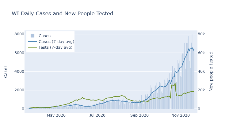
If I write it out loud will I jinx it? There are signs that the case numbers may be peaking. In the past week, the 7-day average for the state has flattened out.

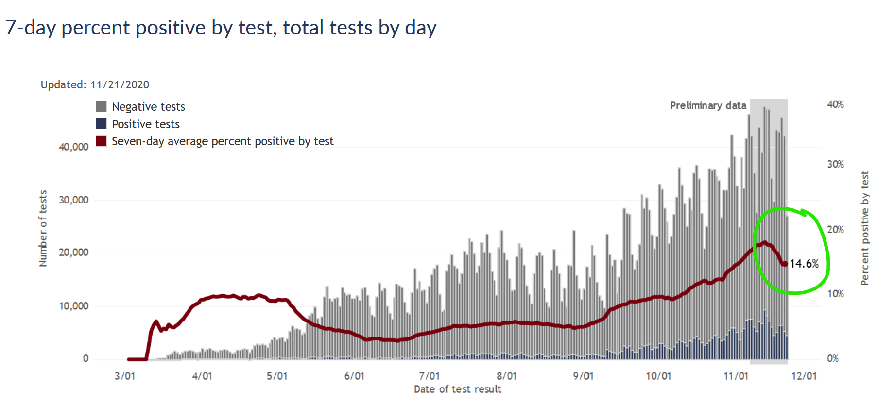
At the same time, the case positivity rate has also started to decline. This chart from the DHS is tricky because it shows positive/negative by date of test, rather than date reported like the one above, so the last two weeks of data is strictly preliminary. (More tests from those days can get reported later.) But my experience looking at this chart is that while the absolute numbers can change a lot, the positivity rate does not tend to change much as more data fills in.

If confirmed cases are flat or slightly down, and the test positivity rate is also down, then we can be pretty confident the true number of people infected is also going down.
This would be great news, though the trend is fresh and could easily change quickly. Keep in mind also that even if cases flatten or decline, it would be several more weeks before we would expect to see deaths do the same.
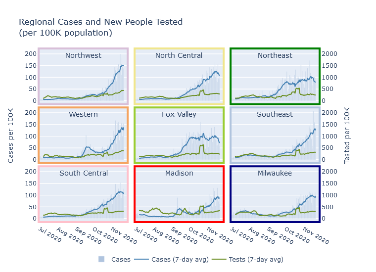
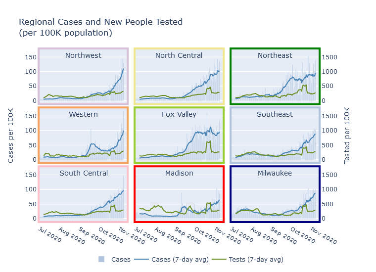
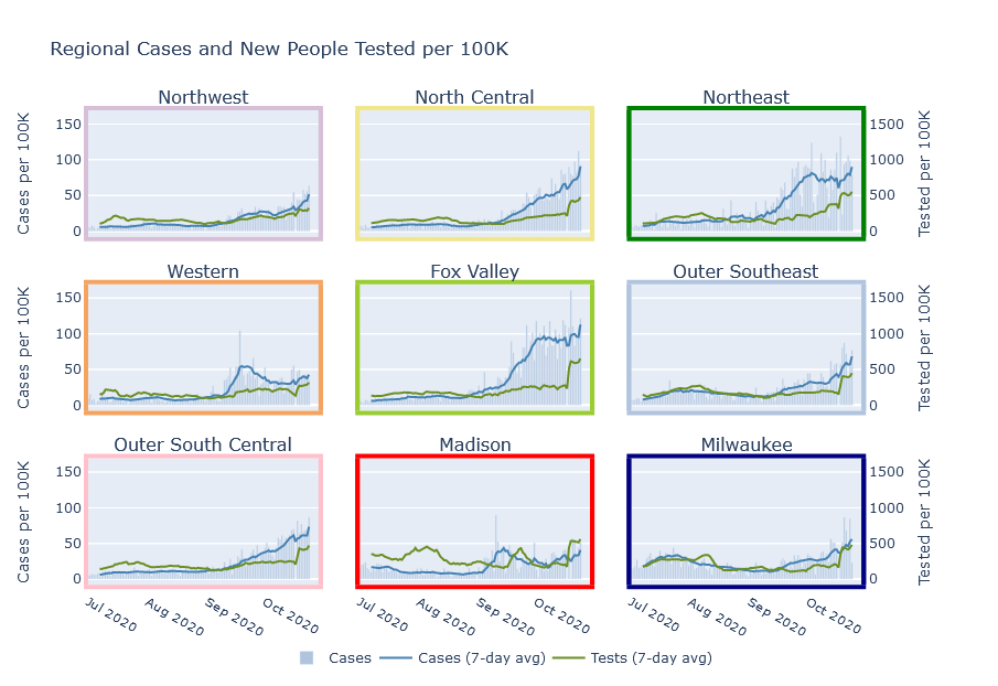
This case trend is also evident at the regional level. Cases in the North Central, Northeast, and Fox Valley are declining. They are flat or declining just slightly in Milwaukee, Madison, and the South Central. But the trend still seems to be increasing in the Northwest, West, and Southeast.

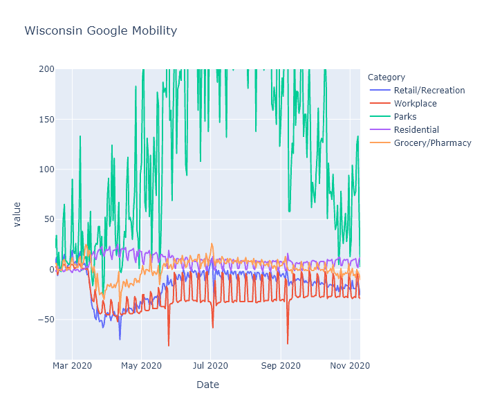
If this flattening trend continues, I would attribute it to two things. First, Wisconsinites’ activity levels have been going down gradually since September, according to Google data, possibly in response to the virus’s activity going up. Second, enough of us have now been infected that partial population immunity could be helping dampen the spread.
How many of us have been infected?
The number of confirmed cases is an underestimate of the true number of infections. So to know how many people in Wisconsin have been infected overall, we need to make an estimate.
Virologist Trevor Bedford made an estimate on Twitter based on using an assumed infection fatality rate (IFR), and reasoning backwards from the number of recorded deaths to the number of infections. The number of deaths is much more reliable than the number of cases (though of course is also subject to errors), and the IFR is known with some precision from a number of scientific studies. He used this reasoning to estimate the number of infections the country has for each confirmed case at 4 to 1, and then applied this multiplier to Wisconsin.
A couple more formal estimation projects are covid19-projections.com from Youyang Gu, a data scientist who became well-known for his Covid model; and covidestim, from an academic group.
Lastly, as to one untimely born, I’ll include my own estimate. I am simply adapting Dr. Bedford’s reasoning, but adjusting it by estimating Wisconsin’s specific infections-to-cases ratio, which turns out to be closer to 3-to-1.
These estimates are summarized in the table below. The date of the estimate is actually important, because obviously we get more infections every week. Despite the disparity in methods, there’s actually decent agreement here - though I have seen other estimates with wider-ranging values.
| Source |
Date |
% Infected |
| Trevor Bedford |
Nov 13 |
21% |
| covidestim |
Nov 19 |
17% |
| Youyang Gu |
Nov 7 |
23% |
| Matt Bayer |
Nov 21 |
18% |
In summary, about 20% of the state has had coronavirus. The resulting immunity, combined with our continuing social distancing efforts, has possibly been enough to stall the case curve. I have some cautious optimism; as ever, though, changing data or deepening winter could always prove me wrong.
15 Nov 2020
Last Tuesday Governor Evers issued an executive order exhorting, but not requiring, Wisconsin residents to stay home as much as possible. Is there any way to know what effect these kind of orders have? How much are Wisconsin residents staying home, and how does it compare to the lockdown in the spring?
Since Covid started, Google and Apple have been publishing mobility statistics extracted from people’s phones. They break it down by state and even by county, so I took a look for Wisconsin.
Statewide stats
The Google data turns out to be more interesting than Apple’s. The following is a plot of Google’s mobility measure for the state of Wisconsin, with categories for retail/recreation, workplace, parks, residential, and grocery/pharmacy. (They also include transit, but I’m leaving that out to reduce clutter.) Google explains that each day is compared to a baseline for that day of the week, measured over five weeks in January. This data shows some really interesting patterns.

-
The spring lockdown caused a huge decrease in activity in the workplace, transit, and recreation categories that gradually recovered to a new normal level that was still substantially lower than baseline. Here I mean “lockdown” as a shorthand for the combination of government restrictions and voluntary actions.
-
Grocery/pharmacy decreased less - obviously these trips are more essential - and nearly recovered to baseline during the summer. I think you can even see a little bump there before lockdown hit, showing people stocking up.
-
Working from home creates a pronounced weekday-weekend pattern, with the workplace category showing large decreases on weekdays. It shows less of a change on weekends, I assume because people who work on weekends (retail, nurses, factory shift work) are less likely to be able to work from home. Weekend work did decrease substantially during the spring lockdown, but in the summer nearly recovered to baseline. Weekday work, in contrast, retained most of its decrease. Residential is just the mirror image of the workplace pattern - if you’re not at work, you’re probably at home.
-
Holidays show up as sharp little spikes. You can definitely see Memorial Day, Fourth of July, Labor Day and maybe Easter if you squint.
-
Parks in Wisconsin are way more popular in July than in January. (Surprise!) They also vary a lot day to day, which I would guess is due to weather. It would be interesting to know if people are using parks less (because of Covid) or more (because it’s the only safe-ish thing to do), but I don’t think this data can tell us that without a prior year to compare with.
-
The Safer-at-Home order was struck down by the Wisconsin Supreme Court on May 13. This data actually does not show a strong change in people’s behavior at that date; make of that what you will. I tend to think it means that popular opinion and social behavior are actually more important than the letter of government policies. But it could also mean that local restrictions picked up the state’s slack; or that it just took some time after the decision for people and businesses to ramp back up; or a number of other interpretations I can think of.
-
The new normal, while much more mobile than the spring, is still substantially less mobile than baseline. I believe this is having its desired effect - despite rising numbers right now, the virus is spreading more slowly than it did in places like northern Italy and New York with uncontrolled spring outbreaks.
Comparing counties
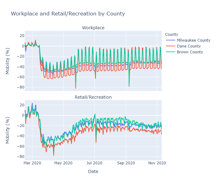
Next I wanted to compare different regions of the state, so I plotted Milwaukee, Dane (Madison), and Brown (Green Bay) counties, focusing on the workplace and retail/recreation categories.

Dane County has been working from home, and reducing visits to recreational places, more than the other two counties. This makes sense, because Dane County is both more white-collar (so more people are able to work from home) and Democrat-leaning (so more likely to be strict with prevention measures) than any other county in the state. Milwaukee County (still Democrat but more blue-collar) and Brown County (politically swingy and quite blue-collar) are closer together, with Brown having the highest mobility levels of the three.
This data may help explain some of the virus’s regional patterns. I have no doubt that virus seasonality is the root cause of our current fall surge. But why did it happen in the northeast first? Perhaps because that part of the state had just slightly higher mobility levels, added to just slightly lower temperatures, to kick off exponential growth a few weeks earlier than elsewhere.
Another temptingly explanatory trend is that since September, the recreation measure has been decreasing in Brown County. This could be from people hearing the news and voluntarily going out less, or it could be just a normal seasonal trend. But perhaps that decrease in mobility, along with some buildup of population immunity, is causing the current virus plateau in the northeast.
These explanations are admittedly very speculative. Brown County’s mobility numbers are higher than Milwaukee’s, but not dramatically. Its recreation has recently decreased, but its score is still not any lower than Milwaukee and Madison, which are currently seeing rising case numbers. Ultimately I don’t think the trends are clear enough to draw strong conclusions.
While super interesting, this mobility data also has many limitations. First, it is all in terms of percentage change from that county’s baseline in January. It does not show some kind of absolute measure of mobility. So Milwaukee’s -20% and Brown County’s -20% may in fact be different levels of activity. Second, it does not capture other important prevention measures such as mask usage, or other types of exposure such as gatherings in homes. Third, since it is from Google it can only capture people who use Google’s mobile services.
What I think it does confirm, though, is that social behavior does directly impact the spread of the virus. The lockdown in spring prevented the kind of outbreak the state is seeing now. Our post-lockdown behavior was enough to stalemate the virus in the summer, and even now is slowing it down. If we keep that up, and even increase our precautions - in a targeted way, using the knowledge we have gained over the last 8 months - I think it will have an impact.
Apple addendum
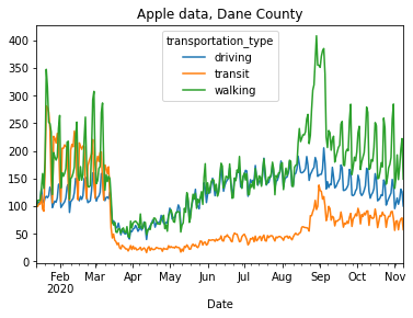
Apple’s data is less useful, because it only measures requests for driving, walking, or transit directions. The only interesting thing I saw was in Madison and was unrelated to Covid.

Walking and transit directions totally spike in early September. Freshmen trying to find their classes?
08 Nov 2020
All together now
All the regions of Wisconsin are now in a pretty similar place for new cases per day as a share of population. The Northeast and Fox Valley regions have actually plateaued for several weeks, and all other regions except Madison have risen to meet them at about the same level. If current trends continue, these other regions of the state will soon exceed the hard-hit Northeast and Fox Valley in new cases per day.

Every day, 0.1% of the population of the state becomes a confirmed case; the true number of new infections is probably 1.5 to 2 times that.
Regions have different death rates
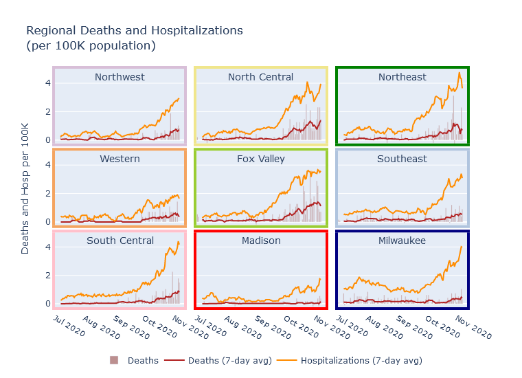
In a previous post I estimated future deaths from current hospitalizations, observing that historically, daily deaths tended to be 15-20% of the number of daily hospitalizations from 2 weeks prior. Since then, the rate of deaths first met and then exceeded my prediction. The current 7-day average death rate in Wisconsin is 40 per day, while 2 weeks ago the rate of new hospitalizations was about 160 per day, for a 25% ratio. Is hospital care and death rate actually getting worse?
I do not think so; instead I think part of the explanation is regional variation. Prior to this fall surge, Milwaukee was the largest contributor to statewide hospitalizations and deaths, so my previous estimate was biased towards Milwaukee’s statistics. The current surge has revealed, however, that there is very large regional variation in this ratio of deaths and hospitalizations. In the Fox Valley and North Central regions, the death rate is almost 50% of the hospitalizations rate! Milwaukee, Madison, and the Southeast are still in the 15-20% range, and the other regions are in between.

I can think of several possible explanations for this phenomenon. Certainly areas outside of Milwaukee and Madison skew older, and so have higher mortality risk. Another possibility could be that the more populous Madison, Milwaukee, and Southeast regions have more hospital capacity, so that they end up admitting a greater proportion of moderate-severity patients less likely to die.
This pattern highlights the importance of looking at more than just the case numbers to understand what’s happening. Milwaukee and the Fox Valley currently have pretty similar per-capita rates of new cases and new hospitalizations, but the Fox Valley’s death rate is 3-4 times higher. Besides the death-to-hospitalization ratio, another cause of this difference is that the Fox Valley’s surge started earlier, so that deaths have had more time to catch up to cases and hospitalizations. Unfortunately, I do think Milwaukee’s death rate will rise sharply in the coming weeks.
Other stories
01 Nov 2020
Covid has killed about 220,000 people in the United States. If you measure by “excess deaths,” meaning deaths that have occurred this year in excess of what would have been statistically expected, and which are most likely under-counted Covid deaths, it is over 300,000.
Either way, that’s more Americans than died in the Vietnam War. On the other hand, it’s half or less than the number of people who die of heart disease every single year. Put one way, it seems like a whole lot; put another way - well, it’s still a lot, but maybe it’s not the apocalypse. Which is the better way of looking at it? How do we gain some intuition for just how serious a problem Covid is?
First, we can make the problem smaller and zoom in on just Wisconsin. The state just passed 2000 Covid deaths. How does that compare to other causes of death? Below is a table of deaths in Wisconsin in 2017, the most recent year for which there is a complete death report from the DHS.
| Ranking |
Cause of death |
Deaths |
| … |
Total Deaths |
52,679 |
| 1 |
Heart Disease |
11,815 |
| 2 |
Cancer |
11,287 |
| 3 |
Unintentional Injury |
3707 |
| 4 |
Chronic Lower Respiratory Disease
(e.g. asthma, emphysema) |
2830 |
| 5 |
Stroke |
2509 |
| 6 |
Alzheimer’s |
2419 |
| 7 |
Diabetes |
1428 |
| 8 |
Flu / Pneumonia |
970 |
| 9 |
Kidney Disease |
922 |
| 10 |
Suicide |
915 |
| … |
Drug overdose
(includes unintentional and suicide) |
1171 |
| … |
Homicide |
203 |
Just looking at this table is enough to rebut two of the common arguments that Covid is no big deal. First, Covid is clearly worse than the flu - it has already killed twice as many people as flu and pneumonia did in 2017, and that’s before we have even gone through a winter.
Second, it seems extremely unlikely that suicides brought on by the social isolation of lockdown will outnumber Covid deaths. An increase in suicide may well be a serious problem; I have not looked into the data enough to know. But suicides would have to double compared to 2017 in order to equal the Covid deaths so far. My intuition is that, as difficult as this year has been, that large of an effect is not plausible.
A third argument, that Covid may be serious but that it’s not out of line with other risks that we routinely tolerate, has more force. Unintentional injury, for example, was responsible for nearly 4000 deaths in 2017, twice as many as Covid so far. Many of these accidents, like Covid, could probably be prevented through draconian lockdowns. If we are okay with 4000 accidental deaths a year, should we accept up to 4000 Covid deaths this year?
Maybe so? In fact, we will most likely have to - I do not think winter will end before we have seen 4000 deaths in this state. Very crudely: extrapolate the current 7-day average deaths per day (38), rounded down, to the end of the year. So 30 deaths/day times 60 days equals 1800 deaths; add it to the current 2000 and there’s a rough 4000.
The case for Covid prevention and action does not really rest on the number of deaths we have had so far, however, but on the number of deaths we may be able to prevent, compared to going back to life as usual. We cannot know this with much certainty, but we can estimate.
Assume a population-wide infection fatality rate (IFR, the percentage of infections that end in death) of 0.5%, and that 50% of the population would become infected before widespread acquired immunity, i.e. “herd immunity,” suppresses the virus. These are arguably middle-of-the-range values. With Wisconsin’s population of 5.8 million, that would result in about 15,000 total deaths.
The IFR and herd immunity threshold are not known with much precision, but we do know them within a range. IFR might be 0.3% or 1%; the herd immunity threshold might be 30% or 80%. Using these numbers, a low estimate of expected deaths would be 5000, and a high estimate 45,000. Here is another table showing these estimates in comparison with yearly deaths from other causes.
| Cause |
Deaths |
| Unintentional Injury |
4000 |
| Covid - Low |
5000 |
| Heart Disease |
12,000 |
| Covid - Medium |
15,000 |
| Covid - High |
45,000 |
| All Deaths |
53,000 |
The low estimate, again, is not so different from unintentional injuries. But even the medium estimate would be the single largest cause of death over a year’s time, eclipsing heart disease. The high estimate would be a disaster, nearly doubling the death count for the year.
Here is my conclusion from all of this. Covid is not smallpox or the Black Death; we are not looking at a third of the population dying. It is not even the Spanish Flu, where 0.65% of the US population died.
But it is bad, and it is worth taking strong action to prevent. If our collective actions can prevent the medium estimate from occurring, and make the low estimate happen instead, it would save 10,000 lives. That would be like curing cancer for the year. There are certainly many questions as to the right actions and the right tradeoffs, but it is clear enough to me that the stakes are high.
25 Oct 2020
Everything is going up
Two weeks ago I sounded a couple optimistic notes - new cases had been hinting at flattening, and Milwaukee’s wave had not yet gotten as bad as the late summer one - that have now been proven wrong. Wisconsin cases numbers paused, as if on a staircase landing, but then sprinted up the next flight. And Milwaukee’s metrics are now the worst they have been overall since the pandemic first hit in March.
That brief flattening of cases reflected numbers in the Green Bay and Fox Valley areas, which have been the worst hit in the state over the last month but plateaued a few weeks ago. They appear to have resumed their rise, unfortunately; and even more unfortunately, the rest of the state is now catching up.

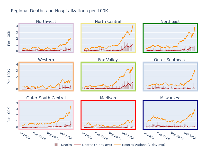
These are plots of cases, hospitalizations, and deaths grouped by region. I am also adding interactive versions of these plots to a new Regional Dashboard page. These are the same regions as shown on the DHS hospital page, but with Milwaukee County and Dane County (Madison) broken out separately. The Northeast, Fox Valley, and North Central regions are still in the worst shape. But Milwaukee, the rest of the Southeast, and the South Central outside Madison are not far behind. The Madison, Northwest, and Western regions are in better shape, but still getting worse.

This fall Wisconsin started with one outbreak in colleges, then a second in the northeast; now it really is everywhere.
College outbreaks are under control?
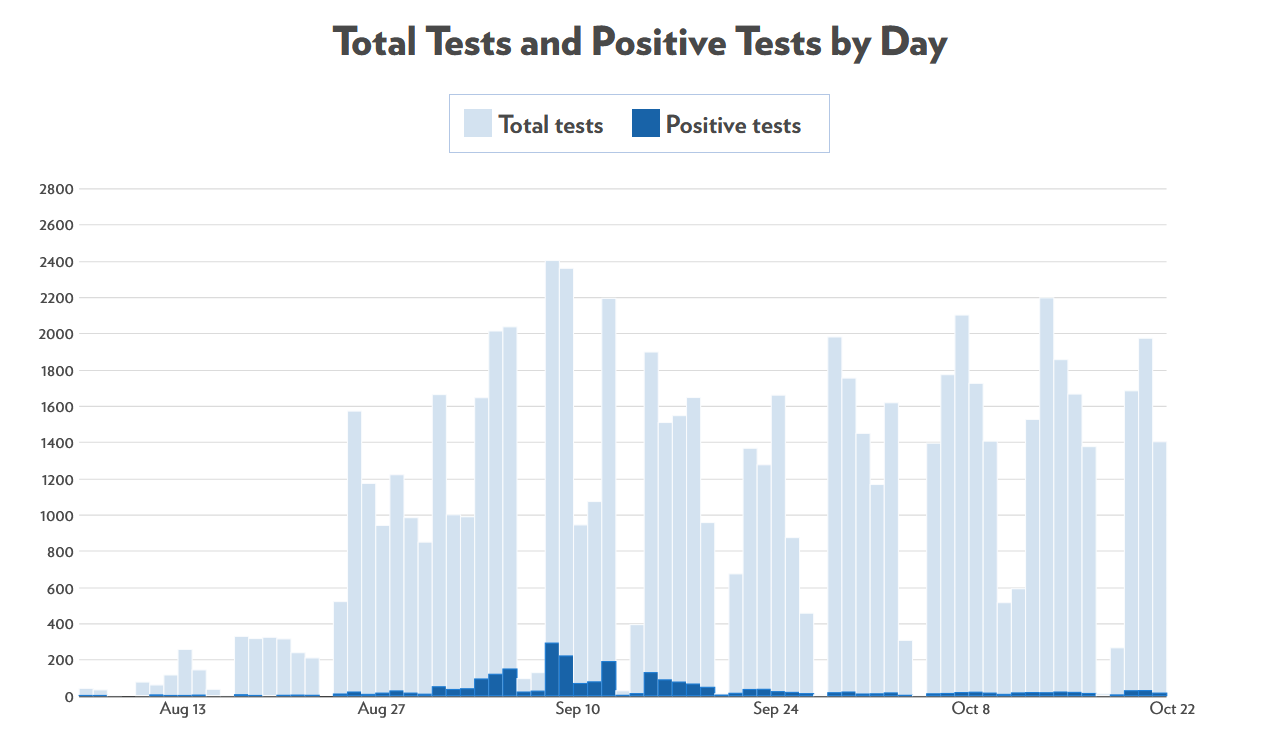
There is one bright spot, though, which is that the college outbreaks seem to actually be under control. Here are cases at UW-Madison:

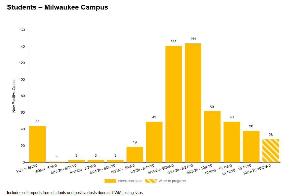
Here are cases at UW-Milwaukee:

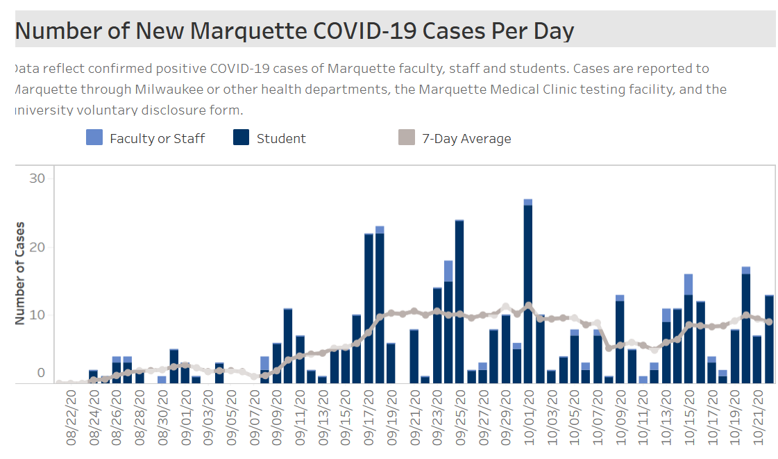
And here’s Marquette. This one’s not really trending down, but it’s at least not exploding.

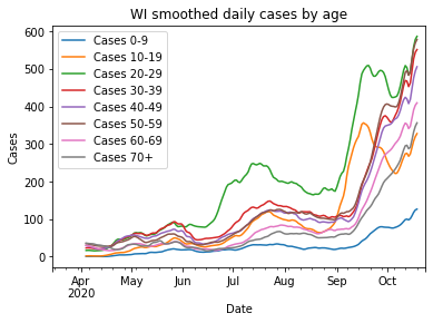
This decrease in college cases could be seen in the data on cases by age, and was another contributor to the brief pause in the state’s case numbers I mentioned above. More recently young cases have gone up again, despite colleges remaining relatively calm. I do not think this is a renewal of college cases, but instead the younger age groups being pulled into the general trend.

It seemed for a while that bringing students back was a huge mistake. But I think we have to give college administrators some credit - at least some of them - for attempting to adapt normal life to the pandemic, deploying testing and lockdowns effectively, and beating the virus back. I have to hope that as a state, we can somehow manage to do the same thing.
Other articles
American Indians hit particularly hard in latest wave
Spring semester plans at UW-Madison
CBS News story from inside Covid unit at Aurora St. Luke’s Milwaukee
