18 Apr 2021
In Wisconsin people over 65 were vaccinated before other age groups, and they now clearly have much lower Covid rates than other age groups.
Over 65
A month ago, the overall case rate was decreasing, but I argued that Covid cases for those over-65 were decreasing faster as a result of vaccinations. It took some analysis, though, because when everything is going down it’s hard to see when one line is going down faster than the rest.
Now that we have had a spurt of new cases we don’t have that problem. You can just eyeball the graph. From DHS:
The case rate for people over 65 (in yellow) is pulling away from the pack. While everyone else’s rates have moderately increased over the last few weeks, the case rate for those over 65 has stayed flat. Let’s zoom in.
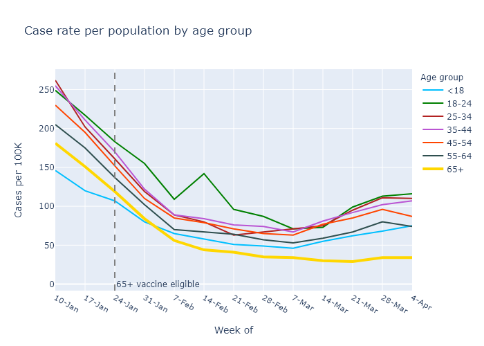
A closer look shows that the over-65 case rate has gone up a bit in the current spurt, but still by much less than everyone else.
A back-of-the-envelope calculation shows that this is about the reduction in cases I would expect from the level of vaccination for over-65s. To see this, let’s compare those over 65 to those under 18. People under 18 have hardly been vaccinated at all, so their case trajectory should show no effect of vaccination.
In the week of January 10, the start of the plot above, the over-65 and under-18 categories had case rates of 181 and 146, respectively. In the absence of the vaccines, let’s assume the ratio of these rates would have remained the same. In that case, by the week of April 4 the under-18 rate was 75 and the case rate for the over-65 should have been (181/146) × 75 = 93.
Since the actual rate was only 34, by this reasoning the vaccines prevented 63% (1 - 34/93) of that week’s over-65 Covid cases. That’s pretty close to the percentage of people over 65 who have already received both doses - 72% as of this writing and a few points lower during the week of April 4. The vaccines are still working.
Other age groups
Now that eligibility is much wider, other age groups are also catching up. Behind the over-65 age group, the 55-64 group happens to have the second highest vaccination rate with 55% one dose and 31% two doses. And the next younger age groups aren’t far behind.
Using my more sensitive normalized plot for Covid case rates, I think you can maybe see a downward trend in that 55-64 group (in black).
So despite the recent increase in cases, vaccination effectiveness looks strong and vaccination progress is still encouraging.
11 Apr 2021
Wisconsin is in the beginnings of a surge in Covid cases. Many of the states in Wisconsin’s neighborhood have it worse, especially Michigan but also Minnesota and Illinois. I think the trends in these states can mostly be attributed to the prevalence of the B.1.1.7 variant.
Conference standings
Below is a plot of average cases per day for these four states, using data from the New York Times.
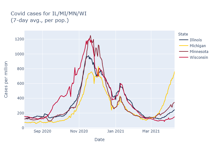
Note: a previous version of this plot had an incorrect y-axis scale. Data includes probable as well as confirmed cases.
For the current wave, it is easy to rank these states in order of severity. Michigan is the worst, followed by Minnesota, Illinois, and last Wisconsin. It is still possible that Wisconsin will follow the same trajectory as Michigan, but with ongoing vaccination and maybe more favorable seasonality coming on, I would expect our later start to the wave to lead to a better outcome overall.
But why the different trajectories in the different states? My guess is that the driving force is the prevalence of the B.1.1.7 variant.
Here is the CDC’s estimate for the prevalence of B.1.1.7 in each state, measured over a four-week period ending March 13.
| State |
Proportion of B.1.1.7 |
| Illinois |
13.1% |
| Michigan |
39.0% |
| Minnesota |
25.5% |
| Wisconsin |
9.5% |
The higher a state’s B.1.1.7 prevalence a month ago, the earlier and higher their cases have now spiked. This suggests that the spread of this more transmissible variant may be sufficient on its own to explain these state differences.
A contrary data point is that other states outside the Midwest, Florida in particular, also have high B.1.1.7 prevalence but are not surging like Michigan. For these states, though, I would speculate that the more favorable climate at this time of year is offsetting some of the B.1.1.7 effect.
Returning to the Midwest, another possibility suggested by the plot above is that the states with relatively lighter fall waves are the ones that are now surging higher; Michigan’s fall appears to have been the easiest and Wisconsin’s the hardest. Perhaps as a result Wisconsin had more built-up natural immunity, or more entrenched cautionary behavior coming out of the fall wave, and therefore was more resistant in the spring.
Messy data sources
I have searched for corroborating evidence for the state prevalence numbers above, but I have not found any source with good data on variant prevalence, over time, by state.
The Wisconsin DHS has a page on variants, but it only shows overall totals. Same with the CDC’s main variant tracker page. I don’t find these very helpful; I don’t really care about the absolute number of cases or how common B.1.1.7 was over the last nine months (not very), I care about how common it is right now.
The testing company Helix has been doing public analyses of its data, including reporting in the New York Times. So far this looks like the best data on the variants in the United States. But while the company has estimates for Michigan, Minnesota, and Illinois that comport with the numbers above, it doesn’t do enough testing in Wisconsin to make estimates for our state.
Another source is the GISAID database, which I have used to plot Wisconsin and which can visualized by state on the site outbreak.info. Unfortunately its data for the other states are pretty noisy as a function of time, although when averaged out they also track with the CDC’s estimate pretty well.
Wisconsin’s B.1.1.7 trend
The GISAID data is all I have for Wisconsin, though, so I used it to revisit my toy model from my first variants post and see how it has matched the subsequent real data. Not too well, it turns out.
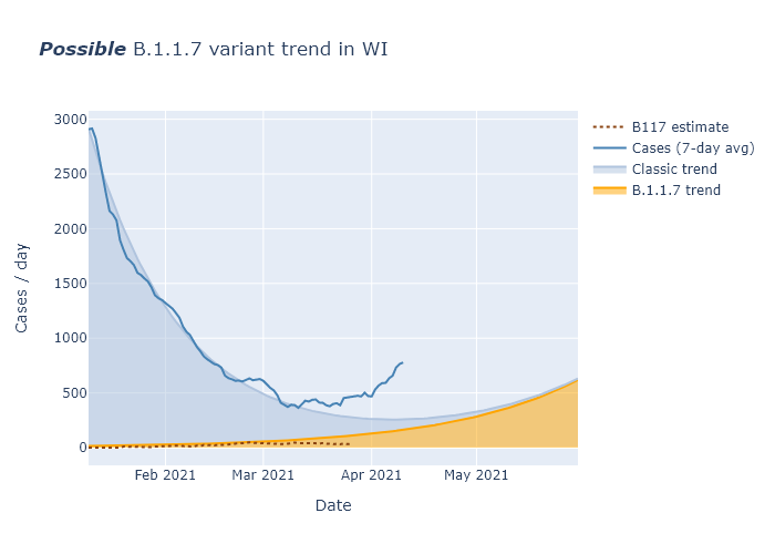
Cases have risen faster than I had thought, and at the same time B.1.1.7 appears to be a lesser contributor than I had thought. My best guess for cases is that people have been doing more activities in the spring, enough to contribute to some spread above what I assumed in the model. And my best guess for B.1.1.7 is that the GISAID data I am using for Wisconsin prevalence is too noisy and delayed to show continued increase right now, but that future weeks will see its share continue to go up as it has in other states. But as usual there’s a lot of uncertainty, and we’ll have to wait and see.
28 Mar 2021
Unfortunately, infections have started trending upwards again, I believe because of a combination of the B.1.1.7 variant and gradually relaxing precautions. But I am still optimistic that vaccinations will keep this last wave small.
Dangit
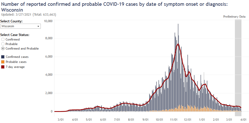
DHS had been doing some data cleaning in the last several weeks, so there have been a couple bumps in reported cases over the last month that I didn’t think had any larger significance. Over the last week, however, more indicators have lined up to show that there is actually a small increase going on. First, there is the test positivity rate:
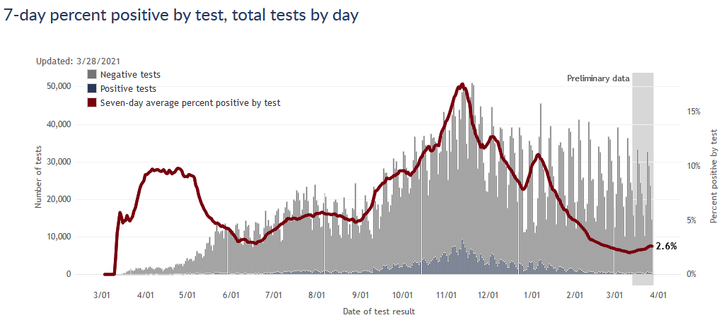
Second, the cases by date of test are just perceptibly trending upwards. This plot is always incomplete for the most recent days, so as data fills in it the upward trend will become more clear.
What’s the cause?
My best guess for the cause of the uptick is a combination of people somewhat lowering their personal precautions (laying no blame, I have done it too), and the more transmissible B.1.1.7 variant gaining a foothold.
First, if I pull an update of the Google mobility data, it does show that retail/recreation activity has increased substantially from a low in January.
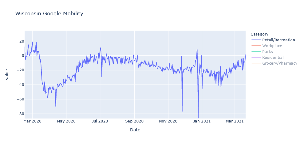
I’m focused on retail/recreation not to blame everything on those activities, but more as an index of how cautious people are being in general. Infections are way down, and vaccinations are up, so it’s not surprising that people have eased up on precautions. But I’m guessing it is contributing to the uptick.
The second item is the B.1.1.7 variant, which experts expect to gradually spread through the country and increase virus transmission overall, in a race with vaccinations. I have been able to get some idea of where this stands in Wisconsin through something called the GISAID database, which is a scientific effort that collects genetic sequences for coronavirus and flu submitted by labs and researchers all over the world. Genetic sequencing can differentiate B.1.1.7 samples from other coronavirus strains. In Wisconsin, places like UW-Madison and the state laboratory are submitting their data to GISAID. If I download all the sequences from Wisconsin and chart the percentage that are B.1.1.7 over time, I get the following plot.
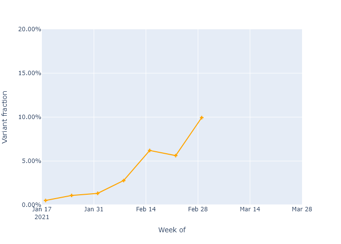
The B.1.1.7 variant is increasing in frequency, as would be expected from having higher transmissibility. The data only goes up to early March, but it’s an easy guess that the trend would continue. So the B.1.1.7 variant could make up more than 20% of cases in Wisconsin right now. I think that is enough to start having an effect on our infection numbers, though not enough to be dominant. As it becomes dominant, the overall virus transmissibility will gradually get higher in the state.
But let’s not freak out
I had really hoped we would not see another wave before this was truly over, so this is discouraging. I’m particularly concerned for central Milwaukee, which has already seen a lot of Covid and now is lagging in vaccinations. And our neighboring states Minnesota and Michigan show that this wave could certainly get worse.
On the other hand, our advantages over the virus have not gone away. We still have vaccination progressing well overall, a mass of people with natural immunity, and the oncoming summer season working in our favor. And many of the most vulnerable people have already been vaccinated. So I would still expect this last wave to be small, and to have a lower incidence of death and other bad outcomes.
Think about it this way. If we’re the Packers, and Covid is…the Seahawks…we’re up five points with two minutes left. We’ve got this, we’ve just got to -

Sorry, the pain is still raw I know. The point is, let’s not do that.
21 Mar 2021
The high vaccination rate of those over 65 is now causing cases to decline faster in that age group. The vaccines are working.
This takes a little analysis to show, however. Wisconsin’s Covid cases peaked way back in November, due to (I believe) a combination of natural immunity and preventive behavior. Whatever the cause, it was far too early to be due to the Covid vaccines, which only began to be administered in December. So how can we see the effect of the vaccines from the state’s data?
One way would be to compare two groups of people with different vaccination rates, and see if their case trajectories were significantly different. People over 65 provide a good test case, luckily for this blog (and for the people over 65).
In Wisconsin, vaccine eligibility was opened to anyone over 65 starting on January 25. Before that, eligibility was limited to healthcare workers and people in long-term care. (Although for Wisconsin, only nursing homes received the vaccine starting in late December, assisted living was delayed until January 25.) At the time of writing, over 70% of seniors have received at least one dose, compared with about 25% for all ages combined. Therefore, between January 25 and today, I would expect to see the Covid rates among seniors decrease faster than the rates among other age groups.
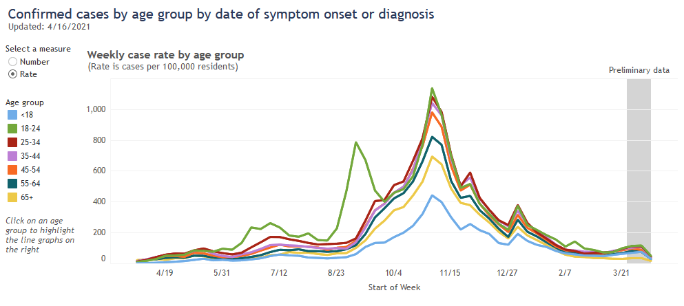
The best data to use for this is DHS’s plot of weekly cases, by age group, by date of symptom onset or test result. Here is the full plot copied from the DHS website:
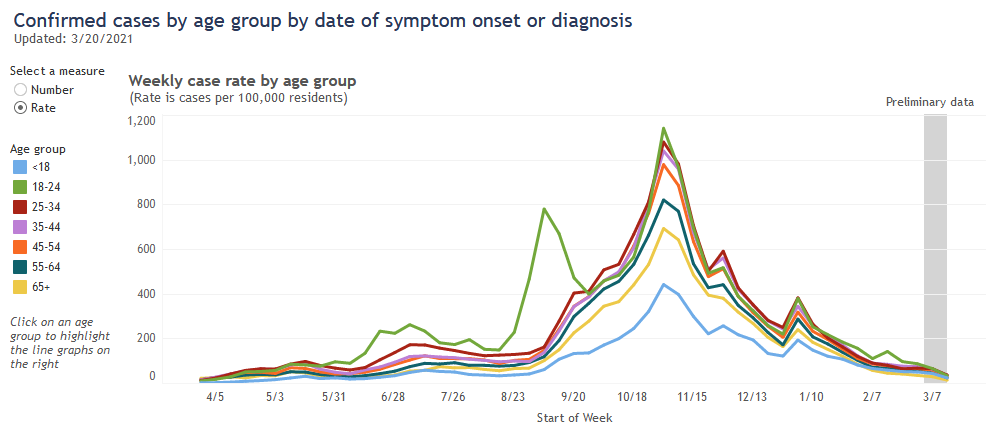
Recently, the over-65 age group (in yellow) has had the lowest case rate, a fact that the Milwaukee Journal Sentinel has linked to their high vaccination rate. I don’t think that fact alone shows much, however, because this age group already had the second-lowest rate throughout most of the pandemic. And because the case rates for all age groups have been going down since November, it’s difficult to pick out whether a particular age group has been going down faster than the others.
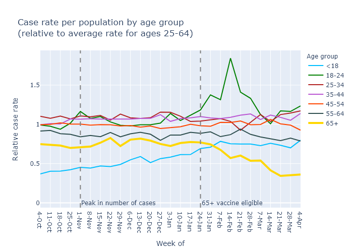
To be more sensitive to this kind of change, I used DHS’s data and tried to normalize out the overall peaks and valleys of the pandemic. The details require some explanation, but the results are in the plot below. It shows each age group’s per-population weekly case rate, divided by an “average” case rate for everyone ages 25-65. If an age group’s value is at 1, then its case rate is equal to the average; if it is above or below, then it is higher or lower than the average.
So this plot allows us to look at each age group’s case rate compared to everyone else’s, regardless of whether total cases are high or low, and pick out trends more accurately. What does it show?
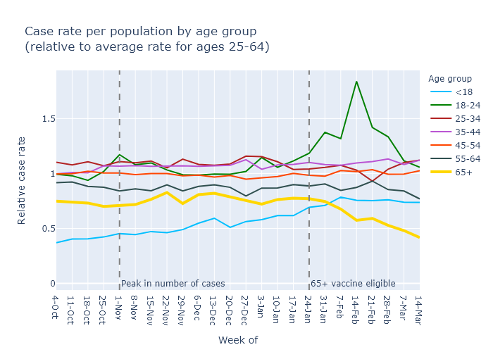
It shows that the vaccines work: the yellow line for cases in the over-65 group has decreased and diverged from other age groups. Moreover, this divergence starts in the week of February 7, two weeks after eligibility - which is telling, because the vaccine clinical trials indicated that high effectiveness begins two weeks after the first dose.
The plot also illuminates a few other points:
- Older age groups have generally had lower case rates; 65+ has a lower rate (its line is lower on the plot) than 55-64, which is lower than 45-54, etc.
- The 18-24 group had a mini-surge in mid-February, which I would link to college campuses.
- The under-18 case rate, while low, has gradually increased relative to the other age groups since the fall. I could guess at several possible reasons for this, including school openings; higher availability of tests making it more common to test mild-symptom cases in kids; or buildup of natural immunity in the other age groups leading to a higher share of cases in this younger group.
But the headline is that people over 65 are increasingly protected, and that is very good news.
28 Feb 2021
Vaccination is progressing well. Case numbers stopped decreasing this week, but I don’t think it’s cause for alarm at this point. Finally, while reported death numbers continue to be erratic, when you look at actual dates of death they follow the case trajectory pretty closely.
Vaccine progress
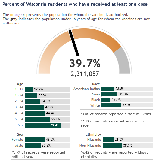
The DHS vaccination dashboard is quite good, so I direct you there for looking at the data by week and by county. Below is a screen grab showing what percentage of the population has had at least one dose.
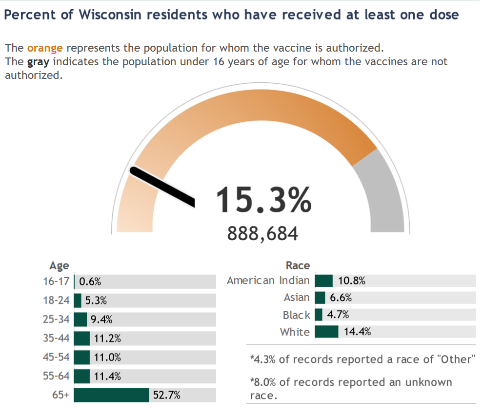
My vaccination takeaways are:
- Just over 50% of people over 65 have had at least one dose of the vaccine. This age group accounts for about three-quarters of Covid deaths in the state, so this is hugely important.
- About 200,000 doses have been administered each week for the past five weeks; that is great progress. While the state seemed to get off to a bit of a slow start, that is behind us and the major limitation on vaccinations right now is supply, not distribution.
- Supply is also increasing, though still not fast enough to meet demand. The weekly allocation of vaccines to Wisconsin, as reported on the DHS dashboard, has increased from 140,000 per week earlier in the month to more like 230,000 per week now. Based on the schedule Moderna and Pfizer have committed to, these weekly numbers should continue to go up throughout March and beyond.
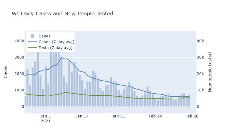
A blip in cases?
At the state level, last week the average number of daily cases flattened and even blipped upwards for the first time in a while. I do not think this is cause for alarm, however, at least not at this point. An unusually high number of negative tests was reported at the same time, so there may be some catch-up reporting going on. The statewide test positivity rate has also continued decreasing. If cases are flat but positivity is still going down, I think that is still a good trend - though of course we’d like to see them both decreasing.
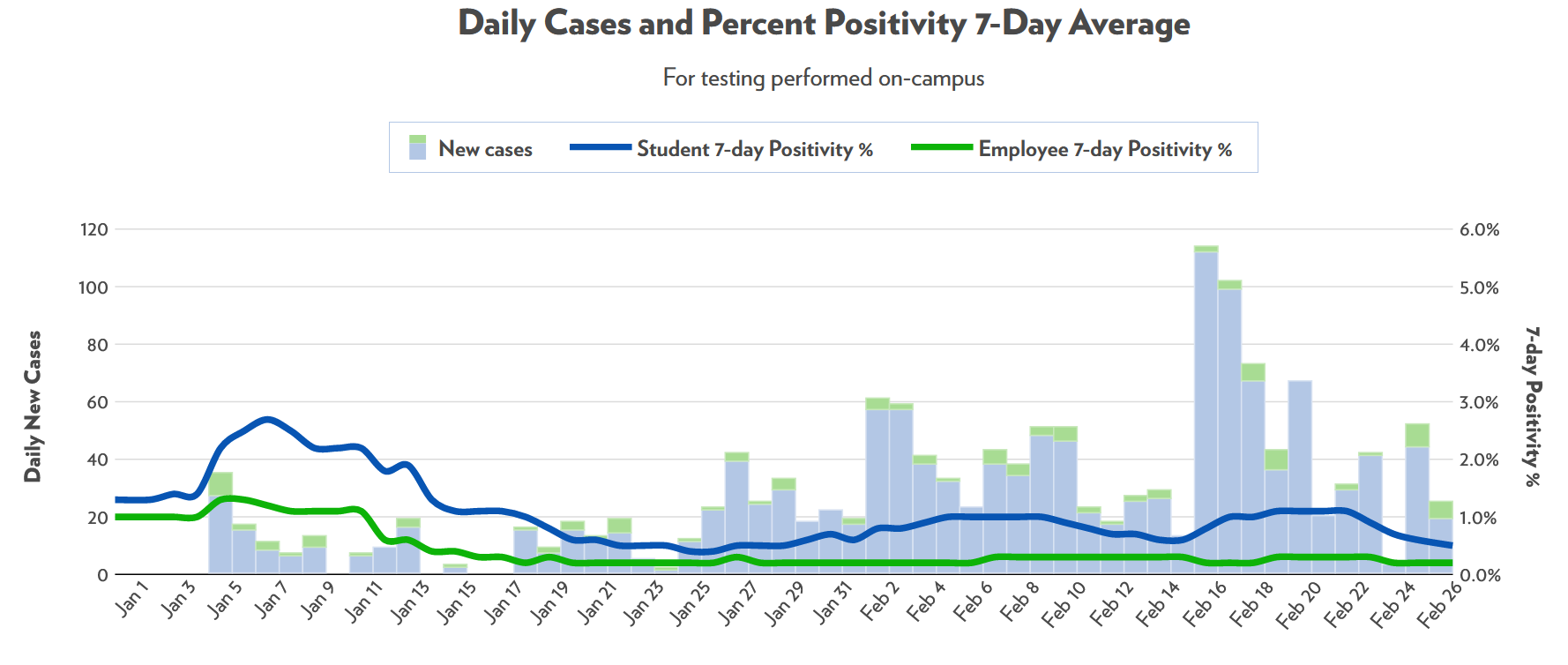
At a local level, the only place that I can tell is having a bit of an outbreak is UW-Madison. I was surprised that it took this long, honestly, after seeing the campus outbreaks in the fall. For now, though, it seems to have already subsided without much fanfare.
Deaths are out of order
If you’re not a Covid data junkie and don’t, like, write your own hobby blog on the subject, you may see the erratic daily death reports and be concerned. If cases are so low, why did we have 52 deaths reported on a single day last Thursday?
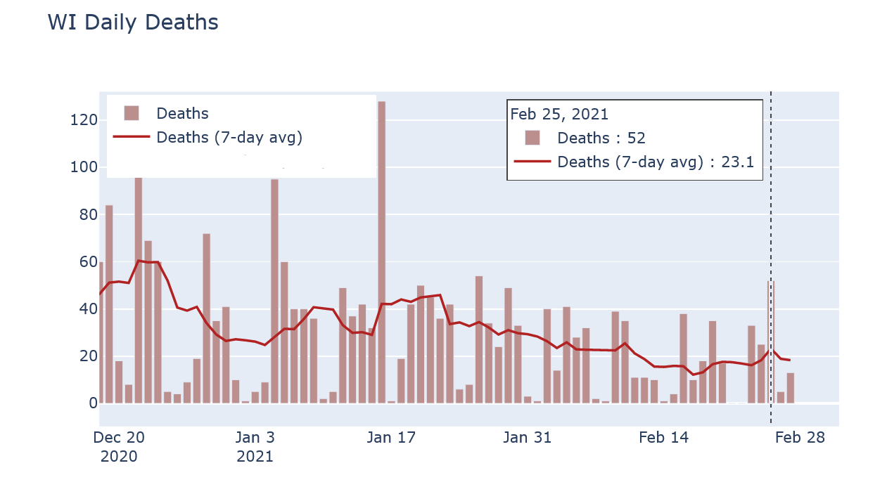
The reason is that reported death numbers are very delayed. Of those 52 reported deaths, nearly half occurred in 2020, and most of the rest occurred in January. Now this day had an unusually high number of old reports, but that’s exactly the reason its reported deaths number was so high in the first place. Reported cases, in contrast, do have their own delays but are much more current than deaths.
If instead I compare DHS’s data on deaths by date of death and on cases by date of test (or symptom onset), the trends look very comparable. The plot below overlaps the two, with deaths moved up by 14 days and the vertical scales matched to imply a 1.2-to-100 ratio of deaths to cases.
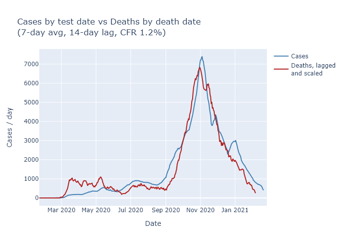
Now the match is not perfect - and note that I’m not even trying to match the spring, when case numbers were much lower due to lower testing. But it’s close enough to give me confidence that the downward trend in cases is also leading to a downward trend in deaths, just as we would expect.